Wednesday, April 30, 2014

Day 30: Cross Stitch Viz of Thank You

30.  

We made it.  We're here.  I this is probably the closest I'll ever come to feeling like I'm on top of Mount Everest.  I've thought a lot about what to say at this point.  I'll level with you - this was a lot harder than I thought it would be.  The content was interesting and I learned a ton, but man was this time consuming.  On average I'm guessing I spent 2.5 -3 hrs a night writing each one of these, cradle to grave.  It made for some looooong days, many of which lasted into tomorrow.  But I think I'll soon look back and be happy I took this on AND completed it.  I certainly wasn't alone in this quest and I'd like to take a few moments and say thank you to a number of people: 

  • First off to my wife, Ms. The Vizioneer, for whom I owe about a month's worth of washing dishes, cleaning up, and paying attention to - tomorrow's May baby :) Wahoo!
  • To Dan Montgomery who contributed in a number of ways along this journey and stepped up with a guest post at the end.  I believe Dan favorite every single one of my #Tableau30for30 Tweets, so if you follow Dan you'll be happy May's coming as well.
  • To John Mathis, Steven Carter, and Peter Gilks (the boys of Slalom), who stepped up when the towel was this close to being thrown, and provided some excellent posts that really enhanced the journey toward the end.
  • To the great folks at Tableau - Ben Jones and Tara Walker - I can't believe that we were just randomly on the same page with April as Tricks and Tips month, but I'm grateful for the blog feature and Twitter hype! It was really encouraging to know that people all over the place were interested.
  • And to the many of you who reached out in one way or another with many kind words of appreciation, I am honored to know that this made an impact for you.
If you've become an avid reader of the The Vizioneer, you probably shouldn't count on much new stuff coming out in May... but what am I talking about?  We still have one more trick to cover for the 30th, so buckle up!

Before we get to what I ultimately did for Day 30, you should know that I've been pondering how to wrap this up for over a week.  I thought about writing on the "ultimate trick", the trick to end all tricks, but it was a moving target depending on who you ask - Andy Kriebel's a pretty big fan of what he calls The Greatest Tableau Tip EVER: Exporting CSV made simple! which was worth considering.  But then Andy Cotgrave and Matt Francis were big fans of putting bar charts in the the tooltip which I have to admit was a pretty awesome idea:


I'd hate to pick "the greatest trick ever" only to find out I was wrong :)

So I decided to go a different route.  Inspired by Ms. Jewel Loree, creator of many beautiful Viz of the Day wins and a Tableau Public goddess,  I give you Day 30 of #Tableau30for30 - Cross Stitch Viz of Thank You.


This is one of those we certainly have to show the end result before we dive it.  So this is where we're headed:


Pretty cool huh?  How did we do it?  Well Jewel gives a pretty awesome step by step on her blog, but I'll give you the dime tour.  We actually start this shindig in Excel (because data doesn't just grow on trees or fall from the sky! It must be created!).  He're what I did - I started by making each cell in Excel 10x10 pixel squares and numbered across the top and down the left side.  Looks something like this:


Then inserted got some word art, found a font I liked, and wrote out a message in the word art. I then took the word art and made the fill transparent, added a solid outline and it looked something like this:


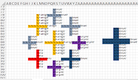
Next came the fun part.  I manually went through and filled in each of the squares that had over 50% of the area as to be filled by the letters.  This took a bit of time (as does anything worth doing - according to my Dad).  But it soon looks like this:


You then do something that I previously didn't know was possible - Find and replace based on formating.  This allows you to write in text where you have cells of a particular color.  Once you go through and do everything, you have something that looks like this:


Now, some additional magic.  If you haven't already downloaded the Tableau Excel Data Reshaper Add-in, then where have you been?  Mother's been worried sick about you!  You better go inside and eat your dinner!

We're going to start in cell B2 and select enough of the worksheet to get every bit of the design.  We'll then fire up the Data Reshaper Add-in and pivot this to make it useable in Tableau.  After it completes and we rename the columns we get this simple table:


It's pretty easy from here.  Bring the sheet into Tableau, Y-Axis to rows and X-Axis to columns (both should be Dimensions rather than Measures), and Color on to the color shelf.  Also worth noting, I had to reverse the direction of the Y-Axis (putting 1 on top, same as it was in Excel, rather than on the bottom as Tableau is used to putting it there). Selecting shape mark type and going with the "X" looking one, and.....
Voila! 


We have a cross stitch you'd be proud to put up on the wall.

And with that, the sound of Boyz II Men tells me that we've come to the End of the Road


It's been fun.  Thanks for hanging out and following along.  If you've enjoyed this, learned something new, or have a favorite trick I missed, hit me up on Twitter @Nelsondavis as I'd love to hear about it.  I love to meet new people and TCC14 is but a short 4.5 months away - if you see me, please stop and say hey!

As always, many thanks - 
Nelson


Tuesday, April 29, 2014

Day 29: Designing for Performance - Tiled vs Floating

As the 30th rolls oh so very close, I'm doing some reflection how we got here.  The reality is that I've learned a ton.  And when I think about where I learned the most over the last year, I always come back to my TCC13 experience in Washington DC.  I learned so many mind blowing things in the span of four days that have greatly impacted and improved the work I've done since then.  One of the sessions that had a dramatic impact on me was "Designing Dashboards for Performance", where the Tableau gurus hit on a number of great points on how to make a slow dashboard sing with speed.  My good buddy (from Day 27) Dan Montgomery wrote a great blog post on many key elements for creating a highly performant dashboard.  Today we'll prove out one aspect of that post, as we look at the classic question of dashboard design in Tablea - Tiled vs Floating (a battle royal) for Day 29 of #Tableau30for30 - Designing for Performance.


So let me quickly reference Dan's blog post and list off the main categories of where performance gains can be found:

  1. Using extracts over live connections - As obvious as it is, this was something I didn't realize until I'd been using Tableau for over a year.  I didn't come from a data background, so I didn't think much about the difference until I was shown the light.  Now, I almost always extract - and you should too.
  2. Add data source filters - this limits the amount of data Tableau has to sift through in order to create your visualization.  If you're going to focus on one area of the business, rendering the rest of your data set superfluous, then just exclude Tableau from bringing it in in the first place.  It will decrease the size of your data and reduce the number of dimensions on the filters shelf, which is also a good thing.
  3. Use aggregated results - I know, I know - you should let Tableau use it's fast data engine to roll up the most granular level of data so that you have the most flexibility in exploring your data.  You know what I say to that? Poppycock!  You know what's faster than the Tableau's data engine? Not using the data engine - that's what.  Here's something to keep in mind - You'll see better performance taking 10 different extracts of different rolled up aggregations of the same 10M+ row data set, than you would taking 1 extract of the granular 10M+ set of data.  It's true basically every time.
  4. Floating your worksheets - This is a great debate. I've bought into this hook, line and sinker, but I know many (Tableau Zen Master Mark Jackson for one), who don't see the need to use garlic cloves to ward off tiled dashboards, as I do.  Today we're going to camp out here and look a simple dashboard built in two different ways and see how they perform.

So the dashboards themselves are not super important, and frankly I wish I was looking at a larger data set, but we're looking at the 14,000 rows of Superstore data.  Here's where the difference comes in: The first dashboard is made by dragging sheets into a tiled dashboard; the second is made bringing each of the four sheets in as floating sheets on the dashboard. 


Basically everything else is the same.  I clicked on the carrot of each sheet and select "Use as a Filter".  I then went and found a magical little problem solving tool Tableau inserted in Version 8.0 called the Performance Recorder (Help>>Settings and Performance>>Start Performance Recording):


Next I selected and unselected one element in each sheet which then pushed that filter to the other sheets.  I went in the same order (Top left, bottom left, bottom right, top right) and select a different element each time so that I knew Tableau wouldn't cache the visualization.  I did this twice, once for each of the types of dashboards.  After completing the four selections, I went back up and through the menu, and stopped the Performance Recorder.  After doing that, Tableau immediately opens a workbook and shows you every little thing it thought about to render your visualization (it's really helpful for problem dashboards).  

In summary here are the results:
Tiled Dashboard: 1.249 sec
Floating Dashboard: 1.038 sec (17% decrease)
Not earth shattering, but certainly meaningful.  Remember, this is a small data set, and we're only looking at four sheets.  

Below are the Performance recording workbooks:


And here's the workbook that I created that has both the tiled and floating example (same as above):


So with that we come to this conclusion - floating is actually better (as we've often heard), but I wouldn't call it a silver bullet.  The best practice is to implement as many of the steps that Dan discusses as possible, and you should be creating some highly performant dashboards.  

Hope everyone enjoyed! We'll see you back here one more time tomorrow before I ride off into the sunset.

Nelson 

Monday, April 28, 2014

Day 28: Playing Hide and Set with Table Calcs

I love this community.  It's full of smart people trying to learn more and figuring out different ways to do things.  If you've been following the #Tableau30for30 all along (I'd like to thank all 4 of you :)), you know that we've invited three guest bloggers to this point.  Today, given the fact that we are coming to the end of our time together, I was considering adding one last one, this interesting tip from the man, the myth, the legend Peter Gilks of Paint by Numbers (and Slalom New York) fame.  We may have to get the official word, but I think he has more Viz of the Day wins than I have fingers.  He's pretty awesome.  So I got approval to share this blog post tip of his on "The End of Time.... series based calculations" but as I was reading it, I started to think I'd solve the same problem differently - AND - since he closed with the following statement: "If anyone has an alternative approach to this I would love to hear what it is, as with so many things in Tableau there are probably multiple ways to achieve the same goal" I thought it would be fun to share an additional way to do it.  Neither way is wrong but I like variety, and it's why God makes colors.  So today I give you Day 28: the Peter Gilks inspired "Playing Hide and Sets with Table Calcs"


I'm going to let Peter provide the setup here (his words in italics, and we're both using Superstore data):
The situation is this: You've got a time series based table calculation going on that you are interested in showing, something like a running total, YTD total or difference from last month, however you don't want to show all the data - instead you only want to show the latest month.


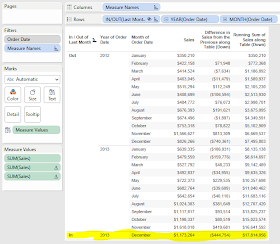
Your starting position might look something like this below, with year, month, sum of sales, monthly difference in sales and running total.


Now lets say you only want to show the latest month, in this case December 2013. Well the first thing that springs to mind might be to filter, but that messes with the calculations PLUS its not going to automatically update to the latest month when the data updates:


Now the next idea you have might be to HIDE the 'non latest month' data, and that will solve the issue of the filters messing up the table calculations, but its still going to leave you with a problem when you get a new months worth of data you want to automatically show. So this is what you can do....Click to see Peter's solution/keep reading to see mine...

I'm going to right click on Order Date and find something you may not have noticed before - Create Custom Date:


And we'll get this interesting dialog box.  Here we have the ability to tell Tableau to create a calculated field that is the same as Order Date, but at whatever slice of the Dimension we want.  Never used this before?  It really comes in handy in a pinch (which is what we find ourselves in) and saves some coding of calculated fields.  I'm going to use the drop down to select Month/Year, like so:


Tableau now creates a brand new field for us called "Order Date (Month / Year)".

Here comes the trick (in a series of moves).  I'm going to right click on this new field, and select "Create Set".  What I want to do is create a set that only contains the most recent month.  Another way of saying that is the Top 1 Month by Maximum Value.  So we'll head to the last tab and fill it out like so:


Once we click OK, we now have a set called "Last Month".  If we click and drag the set "Last Month" up to the first position on the rows shelf, we get below table and instantly realize that the sort of the In/Out in the table actually makes a difference:


Goes to this when you put In on the bottom (giving us what we want):


Awesome! Now we simply right click on the word "Out" and select "Hide" and right click on the In/Out pill and uncheck "Show Header" and voila:


The cool part is that with both of these solutions (Peter's and mine), as the data gets updated, so will the "Last Month".  The takeaway is that sets can be really helpful when dealing with Table Calcs.  


Hope you enjoyed!  TWO DAYS TO GO!  Many thanks!

Nelson

Sunday, April 27, 2014

Day 27: Blending without Common Dimensions

The first time I met Dan Montgomery was about a month in to my Slalom experience.  He was visiting the southland from his home at Slalom Chicago.  He walked in and we immediately started chatting about Tableau.  It was like we were long lost friends who spoke our own language and we were showing off our work from different projects like it was first grade show and tell.  Since then we've both stepped up our game, both winning Viz of the Day twice and taking our Tableau skills to the next level.  So today, it's my pleasure to share this really insightful tip from Dan.  I give you Day 27 - Blending without Common Dimensions:


Sometimes when you're working with data, there is a need to compare datasets that don't really have anything in common.  This issue came up with my Sports Viz Show Me The Money: I had a dataset that contained the top 100 earning athletes in 2013 and I wanted to show what their pay could buy for them at an individual item level with out creating an unnecessary Cartesian product.


Athlete data: a single row per athlete

As Gru would say: Light bulb!  If I create a data set containing a row for each purchasable item repeated the maximum amount of times it would appear (aka the number of times the top earning athlete, in this case Tiger Woods, would be able to purchase it), then I could write a calculated field that blended the two sources and did my filtering for me.


Stuff to buy data: note there is no column mentioning athlete

Doing this gave me two data sets: one that was 100 rows deep and the other just over 5,000 rows deep.


Next, after bringing in both data sets into Tableau, I created a cross dataset calculated field on the 'Stuff to Purchase' dataset that would allow me to filter out when the number of items exceeded the athletes pay.


running_sum(sum([Cost]))<=sum([Forbes 100 Athletes].[Pay $])

This way when I add the purchase able items at a data level, it will continue to referenced the accumulated value of the purchases and restrict them to only total that is less than the salary of the specified athlete.

Finally, I added
- RowID into the details
- 'How Many' true false filter to the filter section
    - IMPORTANT: Change the 'Compute Using' to use RowID
- Add the purchase category and item to the filter section
- Added the object's description to shape
- Filtered it for the specified athlete (from the secondary source).
   - This ultimately ended up being a quick filter that allowed me to select different athletes


Now I had my sheet that showed each of the items that the person could buy.


If I had joined them ahead of time, I would have had a Cartesian product of over 160,000 rows!  This not only saved me data space, but also cut down on the data prep I needed to get dashboard built.  

So the answer all along (to the question that was never asked) was yes, it will blend...even if there are no common dimensions.  Let me know if you have any other questions and feel free to comment.  Thank you!

Thanks for following along!
Nelson

Saturday, April 26, 2014

Day 26: Chart Type Switching

We're close now.  Can you feel it?  You know who's feeling it? Steven Carter - busting on to the scene as a two time Viz of the Day winner up at Slalom New York.  Steven quarterbacks over on his blog at Monday Morning Viz, and if you couldn't tell by the blog name, he's a huge sports fan.  Today, Steven's sharing his all time favorite trick as I present Day 26: Chart Type Switching - Enjoy!


As an avid sports fan, I could not have been more jealous and disappointed in myself that I was not clever enough to come up with the idea for Tableau 30 for 30 on my own. Imagine my excitement when my colleague, Nelson Davis, asked me if I would be interested in writing a guest post. I quickly accepted with one condition… I had to be able to write an article on my absolute favorite Tableau trick of all time. This one comes with a disclaimer people, your audience’s mind WILL be blown, so use it carefully. Today I’ll be showing you how you can use a parameter to switch between worksheet types in your dashboard. This one has been covered elsewhere, but no list of Tableau tips is complete without it! I was first introduced to it over at Alan Smithee Presents, check out his blog here: http://www.alansmitheepresents.org/2014_03_01_archive.html 

Your first step will be to create a couple of worksheets. In my example, I've just used the Superstore data set to create a simple bar chart and bullet chart showing the relationship between sales and profits by region. Feel free to create whatever worksheets you want, the steps will be the same. You may just want to replace “Bar” and “Bullet” with values that make more sense for what you've created.


After throwing together a couple worksheets, create the parameter below:


Place your worksheets on a dashboard and make sure the worksheets are in a vertical container. I’m using a black border to show the container and how both worksheets should fit inside.


Here comes the magic. You will now create a calculated field that takes your Chart Type Selector as an input. The formula below is a quick and easy way to create your calculated field.

CASE [Chart Type Selector]
WHEN 'Bar' THEN 'Bar'
WHEN 'Bullet' THEN 'Bullet'
END

Edit: Zen Master Mark Jackson pointed out that the Case Statement isn't necessary.  The same thing would be accomplished creating a calculated field that simply contained the parameter, as below:
[Chart Type Selector]
Great catch Mark! 

Now, on your bullet chart, right click on your “Chart Type Selector” parameter and select “Show Parameter Control”. Set the value to “Bullet” and drag your “Chart Filter” field to the filter pane and check “Bullet”. Do the same for your bar graph work sheet, set your parameter to “Bar” and then add “Chart Filter” to the filter pane and check “Bar.”
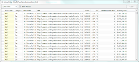
Your bullet chart should now be completely blank and your bar chart should show up normally. Exactly why this works can be a little confusing without taking a look at the underlying data. The below screenshot shows the resulting data when the parameter control is set to “Bar”. You can see that when you select “Bar” in your parameter the values for the Chart Filter field become “Bar” for all records. Because you filtered for “Bullet” on your bullet chart, there’s nothing for that worksheet to show!


After you've added your filters, go back to your dashboard. If your parameter control is still on “Bar” it should look something like this:


Now I know what you’re thinking…Steven this looks ridiculous and I hate you! Settle down folks, we’re not done yet. This step is the easiest, but probably most commonly missed thing I see with people implementing the chart selector. Click on both of your worksheets and check for that rascal of a tack. Clicking the tack will take away “Fixed Height” from your worksheet and allow it to resize automatically.


After setting your worksheets to resize it should look something like this:


This still looks a little bit ridiculous, we don’t want to see the “Bullet Chart” title when it is not selected. Right click on the title and click “Hide Title”. If you don’t want a title to ever show, then do the same for bar chart. If you want the title to reflect your parameter choice, double click on the title of your top worksheet and enter something like the following:
Superstore Sales <Parameters.Chart Type Selector> Chart
If you’ve done everything properly, you should have a dashboard that allows your user to select how they want to see the data. Notice that the color legend is even nice enough to disappear when viewing the bullet chart!


This is a useful trick for sure, but don’t get too carried away with it. Each worksheet leaves about 5 pixels of blank space when it is not selected. This is pretty subtle when using 2-3 worksheets, but can become more obvious as you add worksheets to the container.
For more tips and tricks like this, please check out my blog at http://mmviz.blogspot.com. You can see the chart selector in action on my “Road to the National Championship” viz here: http://mmviz.blogspot.com/2013_12_01_archive.html. Notice that the y-axis in ranking worksheets are in ascending order, while the rest are in descending order. Also, I show a % for the Time of Possession charts. Three different worksheets and you wouldn't even notice if I hadn't told you!

Hope you all enjoyed today’s tip and come back to see what else Nelson has in store for you in the rest of his Tableau 30 for 30.

Thanks for checking us out.  Hasta Manana! 

Nelson