The "Vizioneer" comes from mashing two words that have shaped my world for most of my adult life - Engineer and [data] Visualizations (or Vizes to those who know what's up). Graduating from first from Oglethorpe University in Atlanta, followed by Georgia Tech with my Bachelors and Masters in Civil Engineering, all of which taught me to think through anything and everything - problem solving, "engineering" solutions, teaching to the "ah ha" moments - is what I love to do. In 2010 that investigative, engineering mindset intersected a job change and a plunge into the world of Data Analysis. In the search for the next great thing I stumbled on to a data visualization and dashboarding product called Tableau software and things just took off. So now I guess you could call me that engineer with the sweet data visualizations - or just "The Vizioneer" :)
In 2013, I joined the incredible team at Slalom, focusing on Tableau and it's been an amazing experience. Recently in 2014, I was honored and humbled to receive Tableau's highest recognition of being named a Tableau Zen Master. Follow along to see what happens next :)
The Why “You may choose to look the other way, but you can never say again that you did not know.” - William Wilberforce
Sometimes I wonder ‘What if the shoe was on the other foot? What if I were somewhere else? Would someone on the other side of the planet, fight for my life?’ It reminds me of my own humanity, that we are all common in this – we are given life, and we are assured death; any power that we are given will either be used to seek more power for ourselves, or it will be leveraged to lift others up – there are but two choices. Years ago when I was presented with this truth, I promised myself that to the best of my ability, I would leverage what I’d been given to lift others up. I’m human. I’m selfish. I fail at this more than I want to think about. But every so often I like to think I find a way to deny myself and get this right. And so I wonder ‘What if the shoe were on the other foot?’.
I remember the first time I thought that. Reading about the Rwandan genocide in college made me wonder why more wasn’t done, and why did I have the privilege of being born in a ‘safe world’ where things like that don’t happen. I thought about it again when we worked on the Ebola project, literally seeing life end in the data – ‘What would happen if I were on the other side of this? I hope someone would fight for me….’
Sometimes the data shakes you up. Sometimes you see things you can’t unsee. That happened the day I stumbled into the life expectancy data and visualized evil when it took the form of genocide. The raw melancholy sense that hit me to the core and shook me up for days. I saw the death of a million people in a single line, and I couldn’t keep it inside me. I remembered thinking I had to live long enough to make sure I could publish what I’d found – the world had to see this too.
I know evil is real – I’ve seen it in the data. What I also know is that it thrives in darkness. It becomes powerless in the light. Therefore, the victory is in the awareness of the story, lest we allow our sins to repeat themselves.
This is never more true than it is with human slavery. A crime of humanity that can only exist because the rest of us see an evil so dark it forces us to look the other way. How else can you explain selling one of your children into sexual exploitation so that the rest of your family can eat for another month? How do we go on living in a world where forced labor literally works people to death? Who will stop this? Who believes it can be stopped? If the shoe were on the other foot, wouldn’t you hope it could be stopped? That one day, even you could live a life of freedom? When Alex Duke brought human trafficking to the forefront, it reminded me of these thoughts all over again. I wanted to take the data and make you feel the injustice that’s actually there. I wanted you to feel and see the 35.8 million people in slavery around the world. If you take the municipal population of the 50 state capitals in the US, it would add up to 12.3 million people, a third of what’s going on. Putting it this way, in the US where there’s a little over 300 million people, were there to be 35.8 million slaves here, more than 1 out of every 9 people would be in slavery.
But that’s actually not the case here. So it’s easy to dismiss this as a problem somewhere out there in a land far far away. But I ask you again – ‘If the shoe were on the other foot, wouldn’t you hope someone would fight for you?’
How do we fight a problem like human trafficking and modern day slavery? I would argue that you would battle this darkness with the only thing that come overcome it – light. So on February 26th, World Slavery Day, we paused and shined a spotlight on this issue that lives in darkness, knowing that the light overwhelms darkness every single time.
This is story I wanted to tell. These are the emotions I wanted you to walk away with. Consider this – the only people who change the world are those who believe they can. Whether you believe you can or believe you can’t, you’re right. If you’re reading this, I would bet you’ve been given a tremendous amount of opportunity over the course of your life. What are you doing with that talent? What of your work will echo beyond your grave? Maybe you think you’re powerless given the scale of the problem, but I assure you you’re not. The world is changed time again by a few individuals who raise their hands and are willing to take on the challenge. I believe that’s in all of us, whether we want to admit it or not.
And this is why stories are powerful. Stories and ideas are bigger than their creators. They are not limited by hearts that pump, or air to breathe. Stories and ideas, and our reaction to them, are what change the world. And that is why we chose to tell stories. That is why we visualized this data, knowing that once you’ve seen and understood the story of the data, you would never be able to again say that you did not know.
The How I wanted to do something different. I wanted the tool to disappear and for the story to be front and center. I was inspired by three different sources to go beyond what I already knew was possible. Not too long ago I saw this piece from the NTY on OPEC Oil Prices, a beautiful ‘scrollytelling’ piece Andy Cotgreave highlighted a few months back. It struck me how immersive it was and how I felt I was on a data driven journey guided by the authors. I wanted to make Tableau do this, but I needed some additional ideas on how that could be done. When there’s something hard that I need to spitball ideas on, I call Chris Toomey. Chris had already challenged me to use JavaScript to somehow take the story I would create to the next level. I reminded him for the 117th time that “I’m not a coder” and “I don’t like coding”, yet I felt like there was never such a time to learn as this. I already had the story in my head of what I wanted to show, and Chris patiently worked with me for two hours of looking through different tools and JS libraries that might make this idea come to life. We finally settled on Slides.com and Reveal.JS based on the awesome presentation of Allan Walker, Anya A’Hearn, and Jeffery Shaffer at the Tableau Conference in October 2015, where they demonstrated the new capabilities of presenting Tableau dashboards with enhanced user experience. Given the fact that I had about 12-16 hours of time to put all this together, I decided this was the way to move forward. Lastly, I was inspired by Alex Duke whose passion for this topic required me to go above and beyond what was easy and comfortable. I’m proud of her for choosing to bring this dark topic to the forefront.
First things first, I had to create the visualizations. I had already spent a number of hours reading through the 2014 Global Slavery Index and found a number of stories I wanted to bring to light, but the data and the visualizations had to be front and center in order for the impact to be created. To be honest this was fairly simple and straight forward, as you can tell I’m not doing anything complicated with the visualizations. I needed a way to rapidly bring this together, while at the same time enhance the user experience by leveraging JavaScript to be more immersive for the end user. I’ve said it before and if you know me, you know I’m not a coder, and for that reason Slides.com was a lifesaver for me. Slides.com is like a lightweight version of PowerPoint, but with the ability to embed websites and is hosted online (public for free, private for a small cost).
As I began to test and iterate embedding these into the story on Slides.com (via iframe with the embed code off Tableau Public), I noticed something that I found to be very distracting – Tableau Public. See each viz hosted by Tableau Public has a footer at the bottom, and while we used to be able to use the embed parameters in the URL (which still works for Tableau Server btw) the newer versions of Tableau Public require that this footer shows up. I’ve also been told by Ben Jones that removing it is a no no in the eyes of Tableau based on the current license agreement. But after seeing this from Chris DeMartini where he created a polar clock and got rid of the Tableau Public footer by sizing the viz to be 100% width and 120% height, I figured I could ask for forgiveness later.
While it’s possible to include just the URL from Tableau Public, I actually ended up writing an individual html file for each of the visualizations (10 in all) that became part of the story. I did this so that I could write the custom HTML to cover the footer. Here’s an example of the code from the first map visualization:
<script> var viz, one, workbooka, activeSheet, Worksheet, worksheet;
var onePh = document.getElementById("tableauViz1");
var oneUrl = "https://public.tableau.com/views/HumanTraffickingStory/NumberInSlavery?:showVizHome=no&:display_spinner=no&:jsdebug=n&:embed=y&:display_overlay=no&:display_static_image=no&:animate_transition=yes"; //Total Number in Slavery
viz1 = new tableauSoftware.Viz(onePh, oneUrl, oneOptions); ;
</script>
</body></html>
Again, I basically took this code from Chris DeMartini, stripped out the 1 second refresh, and changed the URL to my Tableau Public workbook. Once I had done that for each of the 10 visualizations, I began to create the linear story using the Slides.com interface. Here’s a quick demo of the tool:
Once I had gotten to a place where I had finished creating slides, Slides.com gives you two options for sharing the content. They can host it – publicly (no security) for free, or include security for a small monthly fee. The other option is to export the HTML and leverage the Reveal.js library for enhanced functionality. Some of the big pluses with using the export is that you can tweak a number of things in the code including:
Pre-loading the visualizations – this is a HUGE feature. You don’t realize how distracting the load time is until it’s gone. This alone is a game changer.
Creating different transitions between background content and foreground content – Slides.com by itself does everything the same.
Ultimately I ended up using both ways of sharing. If you consumed the ‘desktop’ version of the Human Trafficking Story (bitly.com/htsdesktop) then you viewed the HTML export with the Reveal.js tweaks I made (preloading vizzes, auto-playing the video, etc….) which is hosted on a little webserver I have. If you viewed the ‘mobile’ version of the story (bitly.com/htsmobile) then you went to the version hosted by Slides.com without the tweaks. I don’t know why, but the version with the reveal.js tweaks (the ‘desktop’ version) didn’t do very well on my iPhone (it was basically unusable). I’m sure I did something wrong, but I ended up finding that the Slides.com version was solid on the mobile device.
That’s a brief dive into everything. I know I didn’t go step by step, but I’d really encourage you to just go ahead and get your hands dirty with the new toolset. Also note, I’m not saying this is the end all be all – there are thousands of JavaScript libraries that do great things like this. If I can figure out how to make this work (all for the last time, I’m not a coder) then I think it’s worth your time to give it a shot.
The Other Why
You should know the other reason I went beyond what I could do in Tableau alone was I wanted to push the envelope with Tableau and Storytelling, and put some meat on the framework that Jeffery, Anya, and Allan provided. I wanted to push and see what Tableau’s Story Points could be reimagined to become. I hope a future version offers everything you see here and more. This has helped start a number of conversations that I think could ultimately lead to a product where this could be much easier.
I’ve often heard it said that ‘Tableau is the last mile of data’ because much of the heavy lifting ETL, integration, etc… happens before the analysis and visualization. If we keep with that analogy then storytelling should be considered the last 100 yards before the finish. Presenting data and making that presentation have an impact is the whole point of visualization and analysis. If you can’t articulate the story the data is trying to convey, then all the other steps you’ve gone through to get to this point have been for not. My hope is to make sprinting those last 100 yard easier and faster as we go forward.
Matt started the first month of the Reviz Project with the
sobering topic of Gun Deaths in America.
The thing that touched me about Matt’s story was that fact that over 60%
of gun deaths in America are the result of suicide. It was also moving to note that approximately
30,000 lives are cut short by guns each year.
I think about what would have happened to those people if they’d been
able to keep on living. What would they
have done with the rest of their lives?
I choose to focus this visualization on suicide for a couple of
reasons. As Matt pointed out, this is the
majority of gun deaths, yet we’re not talking about it. Our silence allows us to pretend that it’s
not happening. Suicide is devastating. It destroys families, friendship, and
communities. It robs loved ones of a life
that is extinguished too soon and creates a gap through events that never happen and experiences
never made.
I know this because, as a freshman in high school, I went
through it. A senior, with a full ride
sports scholarship in the same sport I loved, and I guy that I’d grown up looking
up to in my neighborhood, committed suicide over winter break using a gun. The school was in shock, and we began the
year with grief counselors. I wondered –
how could anyone, even just a few years older than me, think they had the power
to take their own life? There was such
much love for him now that he was gone – why couldn’t he feel that before he
left?
These questions changed me, and each year I played I wrote a
quote in the bill of my hat in remembrance of him: “If there were no tomorrow,
how hard would you play today?”
To a certain extent I still live this way. I chance more than others think is wise. I take on enough for a 30 hour day. I tell my boys I love them until they roll
their eyes. I remember that life is sacred
and precious. We are not guaranteed
tomorrow – so how should we live today?
Those that lose their life to suicide create a loss that the
rest of the world has to life with. I
think about my friend – he never graduated high school, never took that
scholarship, never got married, never had a son to play catch with in the back
yard, never retired to sit on the front porch in a rocking chair…. There were lives he never touched, because he
wasn’t there to touch them.
That’s the story I wanted to tell. I wanted to show the volume of the years
never lived, stolen by our own hands as the result of a firearm suicide. I wanted to remind us all that those gun shots
often echo for decades, creating gaps that last a lifetime.
One of my father’s favorite movies is ‘A Wonderful Life’ where George
Bailey, in the moment he’s considering suicide, is given the opportunity to
pause and see the impact of his life.
This is done by experiencing the world as if he’d never lived. This alternative world is a shadow of reality,
so painful that he begs to go back a face his troubles, realizing that he
really does live ‘A Wonderful Life’. I
wish the stuff of movies would actually happen.
I wish those considering suicide had a chance to pause and reflect on
the void they leave behind.
So I submit The Suicide Gap to show the lasting effects that tragedy
leaves behind as its wake. May it be a
sobering reminder to us all that we never know the impact of an encouraging
word, or continuing on with a friendship that’s hanging on by a thread.
“One dataset. Three views. One conversation with multiple talking points.
“This should be our communal goal with all data visualization. Humans are social creatures. We learn through conversations. Our opinions sway and change with the ebb and flow of these conversations. Imagine being able to have this conversation with data. We needn't be content with one static chart or one interactive dashboard; we should start with a chart that asks a question and evokes a response.” - Andy Cotgreave, October 2014 (Why a Chart Should Start, Not End, a Conversation)
Why and How – for me, answering these questions has brought about the moments where things changed and perspective shifted. Focusing on these questions has brought about some of my most impactful work and has truly changed the way I see the world in the day-to-day.
Why? Why do we get out of bed in the morning? Why do we do what we do? Why does it matter? It has become apparent to me that the answer to this questions is that we are called to have an impact. Anyone can do it, but few take the opportunity to attempt to change the world. The more I interact with it and the more time I see it, the more I begin to think that telling stories with data truly can change the world. The story is the why.
How? How do we tell the stories? How do we make an impact? How do we grow ourselves and the community? Nothing gets done without intention and we don’t grow ourselves or the community by standing still. Therefore, we must be compelled to take on new challenges and be willing to fail in order to push the ball forward.
As we begin this new year I want to be more intentional about creating opportunities to have an impact by telling stories. I want to grow many ways this year, but professionally, storytelling with data is going to be my focus and to that end, I join with Alex Duke and Matt Chambers to announce the Reviz Project.
The Reviz Project The quote from Andy Cotgreave above comes from a series of events where three different people took the same data set and told three different stories through data visualizations. The data had been seen thousands of times, but by looking at it with a different perspective it was turned on its head and the stories told had a tremendous impact in three unique ways.
The Reviz Project seeks to do the same thing - take a public data set, and have its story told in at least three different ways. The goal is to change the way we look at the world and the way we look at data, and to see the humanity in both. It is not our intent for us to be the only ones involved in this project, rather we invite the community to join with us and tell their own story.
The Details Each month one of the three of us will take the lead (the leader). In the first week of the month, the leader will find a publicly available data source. In the second week of the month, the lead creates a viz that tells a story & publishes it to Tableau Public. In the third week of the month, the other two (the follow-ups) will take that same data set and create new visualizations that tell new stories. Also, at the end of the third week the data will be posted on the Reviz Project blog site. In the fourth week of the month, the community will have an opportunity to take that data set and tell their own story. Those completing their viz by the end of the fourth week can fill out a form and we will host their viz on the Reviz Project Community page. Blogging about the vizzes is not mandatory, but it is encouraged. The follow-ups and the community are allowed to enhance the data with complementary data sources, but the original data source should remain the primary focus of any visualization. The three of us are committing to doing this for at least three months.
We’re already off and running right now! Matt Chambers is taking the lead in this first month of January. Stay tuned to this blog or follow Matt, Alex, or me on Twitter to hear about the steps as they happen each month. Also, please use the hashtag #RevizProjecton Twitter.
This is an exciting opportunity for all of us that we’ve been looking forward to taking on for a few months now. We look forward to your support and hope you’ll decide to get involved. Who knows - you might just tell a story that changes the world.
A few months ago I had a bit of weird dream.Before I share it, I’ll give you that’s not
normal - but normal is boring.So here
we go: I dreamed of a new way to do Tableau dashboard actions.It literally just came to me, I saw it clearly,
and I woke up wondering why someone much smarter than me hadn’t already come up
with the idea.I told you - normal is
boring.
I’ve share the idea with Tableau – will they build it? I don’t know.
Maybe we’ll see it in Tableau 10 or it could be in Tableau 17 – the
crystal ball’s not clear. But I thought
it would be fun to share it with you all, if for no other reason to spark some
ideas of all the different things that can and should be improved/added to the
tool to make our lives easier. But know
this as well – underlying this idea this the notion that the overall user experience
of Tableau needs more attention. We can
see that Tableau’s realizing this – the new visual data window in 8.2 and
improved calculated field window in 9.0 are evidence of this – but we should
all push Tableau for more.
I’ll begin by saying something you probably won’t like. I like PowerPoint. I get why 25+ years later it’s still the
default for presentations – which often are graphical presentations of
data. Now, before you get the
pitchforks, I’m well aware that PowerPoint’s been abused, and you’ve got horror
stories 600 of slide decks with 3D pie charts – I get it. That’s not why I love PowerPoint. My love for PowerPoint comes from my friend
Mark Jackson’s suggestion of using it as a poor man’s graphic design tool, and I’ve
learned to push it to do some amazing things, creating backgrounds for many of
my best Tableau Dashboards. There’s a
number of things in PowerPoint that you should be able to do natively in
Tableau – but can’t:
Multi-select objects on a dashboard
Align objects – top, middle, bottom, left,
center, right.
Group objects together
Resize groups of objects
Move objects together
Draw shapes and do light weight design
(not to beat a dead horse but…) Auto-save :)
And saving the best for last – the ability to Zoom
in and out of a dashboard
The first thing I dreamed about was having an ability to
zoom in and out of a dashboard. Has
anyone seen Tableau on a Surface Pro 3?
It looks awful - presumably because Windows is scaling up the text 150%
(by default) and leaving this visualizations at 100%, but everything looks
cramped. Same thing on many of the Mac
displays with high pixel counts – some of the icons on Tableau become so small
they’re difficult to click and full sized dashboards take up 40% of the screen.
The point here isn’t to gripe, but to
call out why zooming is needed – the days of Tableau 4 and everyone on a 1200 x
800 monitor are gone. There are still
some unfortunate souls dealing with that set up, but most of us have decent
hardware at this point. Yet, it’s
difficult to design to the lowest common denominator without the ability to
zoom in and see what I’m doing.
So here’s what I sketched out – it’s ground breaking! It’s amazing!
It’s… exactly like PowerPoint.
Alright, hopefully you’re convinced on the need for
zoom. I’ve made a few standalone
arguments, but really the call for zoom is self-serving. I need it to exist in order to implement the
real meat of the dream: a new interactive and intuitive dialog menu for dashboard
actions.
Manually creating dashboard actions in Tableau has always
felt very un-Tableau to me. It feels
like a not-so-awesome software wizard where I’m ticking checkboxes on things
that hopefully I named. It’s also
annoying that by default everything is selected, yet there’s no ‘Select
All/None’ button. As a reminder, here’s
our current state:
Now I’m not a UX designer, and these could definitely look
better, but what if instead of having check boxes in some dialog box, they
actually resided on the sheets themselves?
If that were the case, I wouldn’t have to spin my wheels trying to
remember which one Sheet6 is, rather, I’d have an intuitive experience of:
Step 1: clicking on the source sheets
Step 2: clicking on their target sheets
Here’s two examples of what it could look like:
For those of you not into photography (like Dustin and me),
Adobe Lightroom does this effect rather well, and is probably where I got the
idea. Here’s a video showing that
experience:
Now I don’t have this whole thing figured out. I think you should do ‘selected field’ in a
drag and drop fashion, similar to the way it’s done on the new calc editor, but
I don’t know what you’d do if your sheet is too small to fit the checkbox (you
laugh, but there’s a number of Tableau hacks that people use sheets that are 1
pixel x 1 pixel – what do you do there?
I don’t know). But frankly, it’s
not my job to solve it. I’m just here to
push the ball down the field and spark a conversation.
The last thing I’ll say is that now that you’ve
seen these ideas, don’t they feel like they should have always been there? They feel logical and that they would create
a better overall user experience and adoption.
These are Tableau’s goals for their software, as they proved over and
over again, but it’s worth a discussion around points where there’s room for
growth.
If it were up to you, how would you improve the software to
make it easier and more intuitive to use?
I’d love to hear about it so feel free to drop a comment
below and then head over to the ideas section of the Tableau forum and drop it
there too (where someone from Tableau will actually read it).
Thanks as always for spending time and hanging out.
There's some amazing work happening all around us. One of the greatest things about Tableau is the awesome community, and when someone discovers something it's not long before the world hears about it.
Today, I have the pleasure of introducing you to Mark Jacobson, a Slalom Consultant out of the Silicon Valley office. Mark's connected some dots in the Tableau Server Postgres DB repository data model for us, allowing us to better understand how extracts are connected back to their workbooks - something that's really valuable if your Server is overburdened with extract jobs. Check it out!
Connecting the Tableau Server Background Jobs Table back to
Content
If you’ve ever tapped into the Postgres DB
that lies at the heart of Tableau Server, you’ll find that it is
a gold-mine of data about how your users interact with and experience your
Tableau Server. Statistics on everything from how frequently users access
workbooks, when they publish content and how well your server is performing can
be gleaned from this data. And what better way to do that than by hooking up
Tableau directly to get these insights.
Lots of posts have been written about how to access these
tables and Tableau has published a data dictionary
about what you’ll find within. There have also been numerous contributions
from the Tableau Community showing what can be done with this data. Jeffrey
Shaffer, who runs the amazing Tableau Blog data + science, has compiled a list of
these on his Tableau Reference Guide.
Much of my client work is focused on helping organizations
understand what’s going on inside their Tableau Server
platforms. On a recent assignment, I had the challenge of needing to understand
what was causing my client’s Extract Refresh jobs to experience
long delays. I knew that by tapping into the background_jobs
table I’d be able to find my answer.
To see where the delays were, I created a heat map detailing the
delays between the scheduled start time and the actual start time of each job.
This showed me where the bottlenecks were but one piece was still eluding me.
Specifically, I needed to connect the performance of each refresh job back to
the workbook or datasource that was experiencing the delay and then to the
project where it was located.
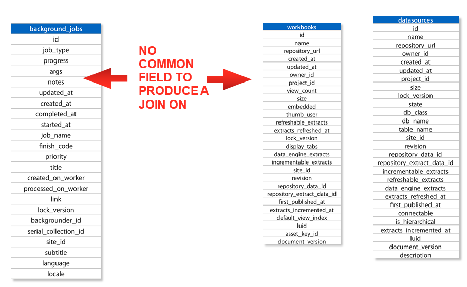
Looking for a Solution
At first this would seem like an easy task. I would just join the
background_jobs table back to the workbooks table or datasources
table on a common ID field and go on with my analysis. That was until I looked
at the contents of these tables. The background jobs table does not
contain a workbook_id or datasource_id like the other tables within the
workgroup schema.
It does contain a “title”
field which has the name value of the content and a “subtitle”
field that displays either “Workbook”
or “Datasource” if the background job is related to an
Extract refresh but this is not unique.
What happens if you have a workbook in 2 different projects with
the same name? How would you know you were getting the job results of the right
workbook? This was indeed my problem so I began to look for a more unique way
to link these tables. After all, Tableau Server has to be able to make this
association so it can perform the desired operation, right?
Discovering the Link
I knew the answer had to be within the background_jobs table, so I went digging. Low and behold, I found my answer within the “args” field. For a Workbook’s Extract Refresh job, the “args” value looks something like this:
---
- Workbook
- 87994
- (string masked for confidentiality)
- 75596
- null
Could one of these values turn out to be the workbook_id or datasource_id I was looking for? Turns out the ID value after “Workbook” is the workbook_id value that will tie back to the workbooks table. Having found the workbook_id, I now needed it in a format that I could use in a join. The next step requires some custom SQL and a little knowledge about regular expressions.
Using the following statement, I was able to parse the “args” string into an object_id:
cast(split_part(
(regexp_replace(args,'---','')),'- ',3
) as integer) as object_id
The statement replaces the dashes and splits the string into its own field which is then cast into an integer so it can be successfully joined with either workbooks.id or datasources.id inside of Tableau’s Data Source editor.
Success! I now had a version of the background_jobs table
complete with the ID of the object being refreshed that I could link back to my
data!
If you’re like me and you’ve
been stuck searching for way to do this, I hope you enjoyed the post. I’ve
created a .tds file and
hosted it on GitHub so you don’t have to recreate the SQL if that’s
not your thing.
Clickable, Drillable Cascading
Dynamic Parameters in Tableau
Dynamic parameters
are a well-documented demand in the Tableau community. The reasons for this are
numerous but most of all simply goes back to better enabling advanced analysis
with a better, more intuitive experience for end users. My experience is no
different. It’s not a problem that I run
into often, but when I run into it, it is a seemingly endless brick wall
between the analysis that I can do and the analysis that I want to do.
Now the solution
that follows solves a fairly specific problem (which we’ll talk about) and is
not intended to be an end-all be-all solve for dynamic parameters (we still
need Tableau on that one). But what I am
going to show you is extremely powerful in the right circumstance - and the
funny thing is that it’s been right in front of our faces all this time.
The solution comes
from an actual client problem that was a bit of a brainteaser for a few hours.
Before I go any further, a big thanks to both Chris Toomey and Allan Walker of
Slalom for allowing me to bounce some ideas off of them, even though I went in
a different direction with this solution. Here’s the situation that were
solving for in the analysis that we want to create:
Working with a
large organization with a five or six step hierarchy, some steps have many
hundreds of members, and the hierarchy cascades very well (ie walking down a
step drastically reduces the pertinent data).
The analysis I want to show is a year-over-year percent change metric
(or maybe a few metrics – sales, profit, cost, etc…), where you can see both
the parent and its relevant children over time AND where the user can either
select a child to drill into (making it a new parent and displaying its
children, one level down in the hierarchy) or clicking and giving the ability
to walk one step back up the hierarchy. Oh, and the client JUST upgraded to
Tableau Server 8.2 (gasp) - so a level of detail calculation is out of scope on
this one.
Did I lose
you? They say a picture is worth 1000
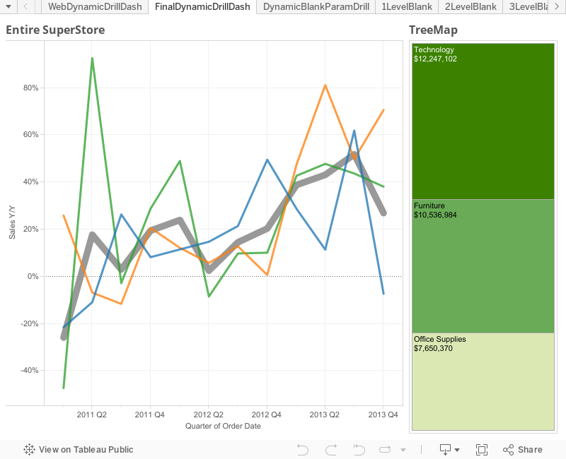
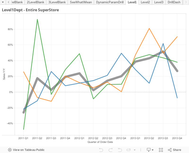
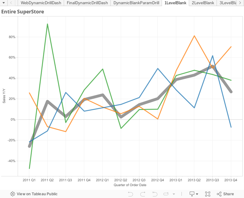
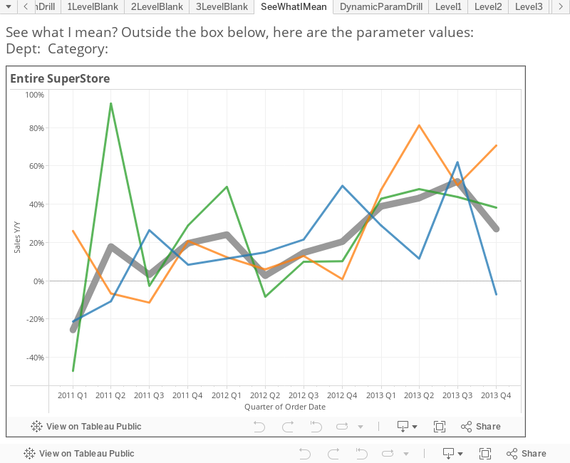
words, so in terms of superstore data here’s an idea what I’m talking about:
As you can see on
the left we’re showing year-over-year change in sales by two different levels
of detail: the thick gray line represents all of superstore, while the three
thinner trend lines represent each of the different departments that make up
superstore (Technology, Furniture, and Office Supplies). Here’s why this is
visually so important - the parent is giving context to the children, so if you
can understand that a parent is down 10% year-over-year, you’ll actually have
admiration for a child that was only off 5% over the same period of time.
Similarly a child that is up 20% year-over-year doesn’t look quite so good when
you realize the parent was up 40% year-over-year. Seeing both levels of detail is
extraordinarily powerful visual analytics especially in very hierarchical
organizations.
Now creating these
views in Tableau at each level of the hierarchy is not especially difficult -
what is extraordinarily difficult is creating the interactive flow and
filtering between these different levels of detail in an intuitive and
excellent user experience. So the
challenge became how can we dive in and out of a piece of the hierarchy without
robbing users of a great experience? I’m glad you asked…
Let’s get a couple
questions out of the way.
Is publishing to Tableau Server or Tableau
Public required for this solution?
Yes, actually it
is. If your organization doesn’t have
Tableau Server and you can’t publish your data to Tableau Public, this isn’t
going to work for you. This hack takes
advantage of a trick with URL parameters, which means it will only work after
the workbook has been published. We’ll
talk about this more in a bit.
Did you say something about dynamic
parameters?
I did and here’s
why - we need to use parameters because we need to know what level of the
hierarchy we need to be on (are we drilling in or going back out?). We also need to use parameters because we
need to hold each of the values that we’ve drilled into the hierarchy (we’re basically
creating a breadcrumb). The easiest way
to understand what I’m talking about is by drilling into the viz below. The simple viz shows how you can leverage
logic based off of parameters to select the correct sheet/level of the
hierarchy as you drill in.
Note: I’m going to
show two different solutions to solve the same problem. This first solution (above) is the lesser of
the two as it has the most ‘gotchas’ and by far the worst user experience -
parameters don’t cascade (or ’show relevant values’ as quick filters can) so by
the time you make your second selection only 1/3 of your choices will actually
produce another visualization. Imagine if each step had dozens of options, they
would be beyond frustrating to get three levels into your hierarchy. Also from
a user experience, if I want to drill into something that interests me I want
to do it by clicking on or hovering over that piece of data. Having to select where to drill via a
drop-down takes me out of the analytic ‘flow’ that Tableau wants me to be in.
But it totally
works - if you have the patience for it. But I’m here to save your patience by
giving you another solution via…
DYNAMIC PARAMETERS!!!
This is actually
shockingly simple, so don’t blink as you might miss it. It actually comes from knowing a little bit
about how URL parameters work. You may
have used these before to create some customize links, or if you have ever
written a blog or embedded a dashboard inside of a webpage you tend to learn a
thing or two on this. And Tableau’s
documentation is very clear on how these work:
Here we learn
first about how we can set parameters in our workbook by putting that value
into the URL, like so (parameters and parameter
values in purple):
and just a little
bit farther down from there we come to find out that we can also set field
values from our data or calculated fields in a similar way (calc fields and field values in
orange):
These are both
very interesting pieces of information but neither is extraordinarily
groundbreaking. The question that I’ve never seen anyone ask is what happens if
I take a parameter value and set equal to a field value - from the examples
above something like this:
By Joe that’s
crazy! If only there was an easy way to do that :) Well of course there is -
it’s our dear friend the URL action. You see making a URL action with a link
that looks like the following would actually create the URL you saw above:
By the way - if
you’ve always wondered what the checkbox on URL actions that says ‘URL Encode
Data Values’ was all about, now is your time to find out, because you
definitely want to check the box when you go with this solution. It’s what handles funny characters like
spaces when you have to put them into a URL.
Here’s some more details if you’re curious:
So what we’re
saying is you can dynamically set the value of the parameter by clicking on
point in the data and using a URL action to set the parameter equal to the
point in the data. They are dynamic
because you set their values when you click on them. They are cascading because of the filter logic
you’re using on each sheet that shows the relevant data for the current level of
the hierarchy. And they’re drillable
both in and out (we’ll show you how in a bit).
Thus, ladies and gentlemen – I give you:
CLICKABLE, DRILLABLE CASCADING
DYNAMIC PARAMETERS IN TABLEAU!!!
I know - where has
this been all my life?
I’m now going to
walk you through how I built a second, more elegant solution which leverages
this URL parameter hack using super store sales data. One big thing to note
before we get started – In the first solution we created two parameters that were
both LISTS of strings based on the values of Department and Category from the
data. In the solution that follows (and
in your solution) I recommend blank string parameters that can be set to ANY
value to accomplish the functionality we’re going to discuss here. The
advantage is that, of course as your data changes there is no need to update
some list of parameters in your workbook.
Also note that you don’t need to create a parameter for the lowest level
of the hierarchy, which in my example is Item (Remember SuperStore is Department>>Category>>Item).
The How-To
To begin we need
to create three sheets, one at each of the hierarchy used that we care about.
Remember the goal of the view the hierarchy is to show two levels at a time - a
single parent and all of its associated children. Also note that in each
example were looking at a year-over-year change (by quarters if you’re
following along with me). I’ll show you how to make the first one, and the
other two you can make following the exact same methodology.
First we’ll create
our year-over-year metric - it’s a Table Calc using the lookup function. We’re
going to compare the current value to the one from four quarters prior and take
the percent difference:
Once that calc
field is created it’s time to make the first view – this will be Y/Y change in
Sales (by quarter and Table Calc using the default of Table Across
(Quarter[Order Date])) at the first two levels of detail: Total SuperStore (one thick grey line) and by
Department (three colorful thin lines). Leveraging
a dual axis (don’t forget to sync them) at those two different levels of detail
and it should look something like this:
Note the two
different levels of detail in each of the dual axis:
Got it?
Perfect. You’re done creating the first
level. Add in any additional
formatting/tool tip cleanup and then duplicate the sheet. I’ve called this
first sheet ‘1LevelBlank’ so that I know it’s the first level in my drill down.
In the duplicated
sheet (‘2LevelBlank’) drill down one level of detail on both of the dual axis –
meaning the axis that showed Total Superstore now shows the level of
Department, and the axis that originally Department now goes to Category. Now given that we haven’t talked about filtering
yet, you’re looking at about 20 lines (3 Departments and 17 Categories). It’s a mess.
Don’t worry, we’ll fix it. Go
ahead and duplicate it one more time (‘3LevelBlank’), this time taking the two
different levels of detail down to Category and Item (the lowest level for our
example). If you thought the 3
Departments and 17 Categories were a mess, then this is an absolute
disaster. Again, don’t worry, we’re
about to fix it. Now that our three sheets are created, let’s go ahead and
create our parameters and filters.
Parameters and Filtering
As noted earlier,
the easiest thing to do is to create two blank string parameters and set their
default values to be blank. In this
example, I’ve named the two parameters: 1DeptBlankParam and 2CategoryBlankParam. Here’s an example:
Creating the
filtering is really simple as well. We’re simply going to match the parameters
we created above up with the fields from the data. Here’s an example:
Now, the first sheet,
‘1LevelBlank’, doesn’t require any filtering, so let’s head to the sheet on the
second level, ‘2LevelBlank’. On the
filter shelf add the filter we just created where [1DeptBlankParam]=[Department]. Because the parameter is blank, set the filter
to exclude False (ends up doing the same as keeping only True).
Go to the last
sheet, ‘3LevelBlank’, and add the filter for [2CategoryBlankParam]=[Category]. Filter it the same as before, excluding False. When adding the filter on sheets 2 and 3,
they should disappear – if they don’t it’s because your blank parameters aren’t
really blank. To test if you’ve done
everything right, show the ‘1DeptBlankParam’ parameter and type in ‘Technology’
– you should see some lines show up on the 2LevelBlank Sheet. If that worked, type in ‘Copiers and Fax’ in
to the ‘2CategoryBlankParam’ parameter – and you should see some lines show up
on the 3LevelBlank Sheet. Once you’ve both
successfully, clear both parameters and move on to the hack that brings it all
together.
The Hack
Now, you’re all
probably very familiar with the fact that you can create actions on dashboards. Should this be news to you, please go and
check out Peter Gilk’s great post on Dashboard Actions http://paintbynumbersblog.blogspot.com/2014/10/a-rough-guide-to-tableau-dashboard.html
- well done and rather comprehensive.
The interesting thing that most people don’t know is that basically all
of these same actions dashboard actions can be done in the worksheet view. Since we’re all about trying new things, we’ll
take this road less traveled and add some worksheet actions.
We’ve already
discussed that URL Actions are going to play a key role, so on the first sheet,
1LevelBlank, go up to the top and select Worksheet>>Actions
You’ll be greeted
by a very similar action menu that should look very familiar. Click Add Action>>URL. This is where we get fancy. Since we’re going to create a ‘run on menu’
action, the name of the action is what will show up at the bottom of our
tooltip. In the name field, type: ‘Drill
in to ’ and then click on the arrow at the end.
Here, select ‘Department’ which will show the value of the Department
you’re hovered over.
Select only the
current sheet in the check boxes, 1LevelBlank.
Head to the URL
tab and paste in the following (we’ll dissect it next):
There’s a lot
going on here so let’s talk about each piece so that you understand it. Understanding all of this is very important
because this is how you make it both clickable and dynamic so that everything
works.
This is nothing
more than the URL address of sheet ‘2LevelBlank’ on the server. Remember, you’ll be on the highest level of
the hierarchy on sheet ‘1LevelBlank’, so this is going to move you to a
different sheet one level down in the hierarchy. The easiest way to get this URL right is to
publish the workbook (either to Tableau Server or to Tableau Public, like I’m
doing here). The format is clear:
http://<server>/views/<workbook>/<sheet>
So you should be
able to plug in your values and go.
They’re all
specified here: http://onlinehelp.tableau.com/current/server/en-us/help.htm#embed_list.htm
The ? means we’re
going to add some details (parameters) to the URL. The : that follows it means that
the detail is for how to render on the server (without the :, shows that we’re
setting a value in the workbook either as a filter or parameter – which we’ll
do at the end of this).
:showVizHome=no
This gets rid of
the header at the top of the viz (that is now rather large in v9). Here’s an explination by the famous Ben Jones
of Tableau Public. https://public.tableau.com/s/blog/2014/03/how-fix-your-iframe
&
It means there something
else I want to add to the URL. Separate
each ‘detail’ parameter in the URL with this ‘&’.
:embed=y
‘Required for URL
parameter. Hides the top navigation area, making the view blend into your web
page better.’ When they say required,
they really mean some of the other URL parameters won’t even work if this isn’t
included. Obvious, but worth mentioning.
:tabs=no
Hides tabs, even
if you tick the box in the publishing dialog to show the tabs (which you should
do in this case).
:linktarget=_self
Specifies he
target window name for external hyperlinks.
There’s two options here – ‘_self’ which we use here means open in the
same window/tab; the other option ‘_blank’ would open the URL in a new
window/tab. Using this will re-spin the viz in the same window/tab, which is
the user experience we are looking for.
As we addressed
back in the beginning, the trick that we are doing here is setting the
parameter ‘1DeptBlankParam’ to be equal to the department that we click on in
the viz. Here’s what that looks like
when we add in purple for the name of the parameter
and orange for the
field value from the data:
1DeptBlankParam=<Department>
In the last piece
we are simply reminding Tableau that we want the second parameter to remain
blank. You should now understand all of the pieces of the URL that we’ve
created.
Lastly, to the box
for ‘URL Encode Data Values’ - this should properly encode any spaces, commas,
and other special characters that are in the data. It is very important that you check this box.
Here’s what
everything should look like:
Now, here’s what
the drill in URL menu action for the next level down on sheet ‘2LevelBlank’
looks like – the only changes are in bold at the end:
What we are doing
here is going to a different sheet one step down in the hierarchy (‘3the
Department parameter is holding the value that we gave it in the first drill
down (we’re reminding it of the value we set it to in the first drill down),
while we are setting the value for the category parameter based off the
category that we’re clicking on in the viz (just as we did before with
Department, one level up). If you have
additional levels in your hierarchy, you would simply continue creating URLs
where the previous parameters would hold their values, the current level would
set the value of the parameter, and lower levels would remain blank.
Great – now how do
I go back up the hierarchy?
If you’re at the
bottom level of the hierarch on sheet ‘3LevelBlank’ (which is where you’d be
after the step above), then you’d want to do two things: 1) Go to the sheet one
step above in the hierarchy (in this case ‘2LevelBlank’ and 2) Clear the
parameter ‘2CategoryBlankParam’ while holding the value of the first parameter ‘1DeptBlankParam’. All you have to do is create a URL that does
exactly that:
Now we could
simple publish the tabs, and the interactions would pretty much work, but the
user would be heading to a different URL with every click. This isn’t a winning formula. Instead, we’re going to create a dashboard
and put the whole flow inside of it.
This way it’s easily accessible from Tableau Server.
It’s easier than
you think – Create a new dashboard and name it whatever you want (mine is
called DynamicBlankParamDrill).
Add a web page
object and let it take up the entire dashboard. When prompted for the URL, put
in the URL for the highest level, with blank parameters:
First off, you’ve
just created a dashboard with a dynamic parameter! Wahoo!
Now we should
talk. If you’ve made this far and you
understand everything we did then you’ve probably already realized some things:
1)Using
this method as outlined requires you to create a different sheet for every
level of the hierarchy – This is less than optimal if there are many levels/layers
in your organization’s hierarchy.
2)You
can only dynamically drill in and out of one sheet at a time. This is because you can only send a URL to
one web page object on a Dashboard.
3)If you’ve
played around with the dashboard, you may have figured out that the dynamic
setting of a parameter in the web page object doesn’t extend to other parts of
the dashboard. What I mean is that if
you have the parameters on the dashboard and the web page embedded – the parameters
are only being updated in the web page object, not outside of it. Think of movies like Inception or The Matrix –
The experience was inside, while the person existed outside. This is no different – Even though I can show
the parameters existing on the dashboard, the experience is inside the web
object – and they don’t really tie together at all.
Now those seem
like big limitations – and they are. But
you can actually overcome them all. Here’s
how:
Advanced Jedi Tricks
At the client
where I put this together, I needed to not only be able to go up and down the
hierarchy in a sheet, I needed to create a complex dashboard with multiple
sheets. I also had six levels to go up
and down – so there was no way I was going to create six highly complicated
dashboards, with all the actions and sheet placement, and then reference each
one in the URL. I would have gone
insane. Now that you understand the
basic framework from above – and I walk through that basic example in detail so
that this advanced use makes sense – I’ll talk about how I make this work on a
complex Dashboard.
Parent and Child Dimensions, Filtering,
and URL Fields
What you need to
be able to do on the fly is to know – based on the parameters I have values for
– what level of the hierarchy am I on?
If you know what level you should be on then you can set four very
important things that drive everything:
1) The Parent Level 2) The Children Level 3) The Filter 4) The URL Fields
If you go this
route and use logic based on the parameters, then you can create a single sheet
that can set itself to the correct level of the hierarchy.
Basically we test
the parameters to see if they’re blank.
To do this we use the LEN() function (returns a number as the length of
a string based of the number of characters) and it looks like this:
Len([1DeptBlankParam])=0
and
Len([2CategoryBlankParam])=0
Now if this is
true, we’re at the highest level.
Because there’s three levels to our hierarchy, we’d do this twice more:
Len([1DeptBlankParam])>0
and
Len([2CategoryBlankParam])=0
This puts us one
level down. And….
Len([1DeptBlankParam])>0
and
Len([2CategoryBlankParam])>0
Puts us at the
bottom level. Create each as its own
calculated field – it will save you some time later. If your hierarchy has more levels then build
as many of these as you need.
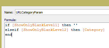
Now we’re going to
create Children Dimension – We’re basically going to say ‘when we’re at
x-level, that means y-field is the correct spot in the hierarchy’. It’s
actually very simple:
if [ShowOnlyBlankLevel1] then [Department]
elseif [ShowOnlyBlankLevel2]
then [Category]
elseif [ShowOnlyBlankLevel3]
then [Item]
end
The Parent Dim is
just like it, except one level up on the hierarchy:
The last thing we
need to do is build the filtering. This
is slightly tricky, but you’ll get it quickly:
Now, here’s the
awesome thing – You can build as many sheets as you want! Just make sure you use the Parent and
Children Dimensions for your slicing and filter everything on the filter we
just created.
When you bring
everything in to a dashboard everything will be based on the parameters as they
are set. You’ll create dashboard actions
(so that you can apply them to multiple sheets, rather than just one at a time)
for the URL links. Note: Instead of referencing different sheets as you did
before, you will reference this same dashboard view in the URL – only the
Parameters in the URL will change.
This brings up to
the last bit of trick-er-a-tion: You’re
URL has to be dynamically created, which means for every click you’re going to
set each value, just as we did before. But it was easier before because we
manually made the URL based on the sheet we were on, but we don’t have that luxury
now that everything comes from the same sheet.
So – We have to create fields that do this for us and then call those
fields on any sheet that needs the ability to drill.
I’m sure that was confusing.
It will make sense in a minute.
The goal here is
to tell the parameters what value they should be set to on a click. So on a drill in click going from Level 1 to
Level 2, the Dept param should be changed to the Dept that was clicked. When going from Level 2 to Level 3, the Dept
param should hold it’s value. Here’s how
to write that:
At the same time, on
a drill in click going from Level 1 to Level 2, the Category param should remain
blank. But when going from Level 2 to Level
3, the Category param should should be changed to the Category that was clicked. And here’s how to write that:
Now, you’re going
to need to call those values in the URL, so take both fields and add then to
the Tooltip on the ‘All’ marks card:
I’ve also added
the way to drill back out (download to see it).
Almost done!
Dashboard time – Create a new dashboard (Mine is called ‘FinalDynamicDrillDash’). Set the size of the dashboard to Automatic
and bring in the sheet you just created.
Click on Dashboard actions and select URL Actions.
We’re going to do
just as we did before with some moderate tweaks. The URL is going to be self-referencing and
the parameter values are coming from the fields you just created. It looks like this (note the bold parts:
You’re done with
that dashboard for the moment. Just as
we did before, create one last dashboard with just a single web object. When asked for the starting URL, use the one
from above, but remove the parameter fields (we want them to be blank when it
loads). It should look like this:
To prove out the
dashboard concept I added a Tree Map sheet as well and allow the user to select
either sheet to drill in.
Here’s the final product:
I can’t believe
you made it all the way through this post.
Thanks for hanging out. Hopefully
you’ve learned a couple things. The
Analysis that you can do with this is incredibly powerful! So go out and change the world with your
dynamic parameters in Tableau!