
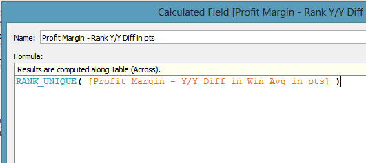
The farther you go with this thing we love called Tableau,
the cooler and more advanced analysis you want the ability to do. Over the last
few months I’ve had an opportunity to work on a number of really interesting
projects. The one that’s been taking my free time has been for awesome cause:
creating dashboards to help track and stop the Ebola spread in West Africa.
It’s a part of the work that the Tableau Foundation is focused on with an organization called Dimagi, an award-winning global
health software company, and the Columbia University Earth Institute. Fellow
Zen Master Peter Gilks, of Slalom New York, has been the lead on this project
and I would guess has spent well over 100 hours of his free time working to
make it successful. If you know Peter, please thank him for the time he’s
invested. It’s certainly been a labor of
love for all of us. The other
interesting work has been focused on my client in the travel industry, slicing
and dicing data in ways that I honestly have never been able to do before - and
what has been a big factor in the success of these projects? My head-long dive
into Nested Table Calcs!
Even as a Zen Master, I’m always learning - and I have A LOT
to learn. Different projects, different clients all require new things, and the
depth of the analysis that is possible inside of Tableau becomes even more
apparent the farther down the rabbit hole we go. I would argue that beginning to understand
today’s topic of Nested Table Calcs is the best way to take your Tableau game
to the next level, and provide your users with even more in depth analysis.
We have to start with some fundamentals, but we’re also
going to make a couple assumptions.
We’re going to assume you know at least a little bit about table
calculations, though we’re certainly going to discuss how those are constructed
as well. We also need to assume you want to perform some sort of analysis that at
least a little bit complex and is going to require at least two or more steps
of transformation/calculation.
So let’s start with the basics - what exactly is a Nested
Table Calc? I’m so glad you asked! While there are some things in the world of
technology that have names or acronyms that defy logic, this is not one of
them. These things act just as you would think of Russian nested dolls:
something small and simple is used to create something slightly larger and
slightly more complex, which is then used to create something a little bit more
advanced, and so on and so forth.

The calculations build one on top of the other, allowing you
to produce super complex analysis like:
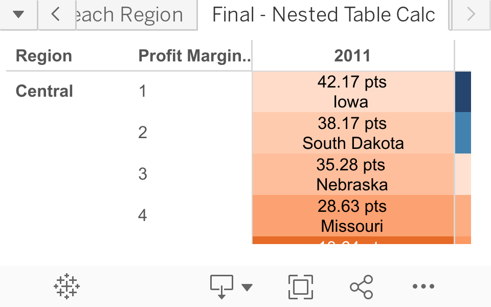
Rank the top five states in each region by year-over-year change in average monthly profit margin.
See? Pretty cool stuff, huh?
The orange parts are the table calculations. Stacking (or nesting) table
calcs in each part of that analysis in just the right way allows us to do
something super complex, and should begin to give you a little bit of insight
into the power of what were actually talking about here.
You should also know there is a tremendous amount of awesome
work from the likes of Joe Mako, Jonathan Drummey, Noah Salvaterra, Keith Helfrich (not a Zen, but sure could be)
and many others on this subject, and I would certainly encourage you to dig
deeper by going through their work on this.
Without them, I’d still probably be lost in the dark when it comes to
all this stuff.
So why don’t you say we take that little example we
discussed before (which I came up with on-the-fly) and walk you right through
it? Sounds like fun! Here we go….
Just as we seemingly always do, we are start off with
popping open Superstore Sales data (the one with English in the title). We’ll
start by dragging region to the filter shelf and excluding International (I
mean, we’re looking for states here). Alright - let’s begin by remembering the
goal of the analysis:
Rank the top five states in each region by year-over-year change in average monthly profit margin.
Got it? Because we’re doing nested table calcs we’re
actually going to begin at the end.
Let’s get set up to show monthly profit margin. Start with Order Date and throw both year and
month on the column shelf. Also, go ahead and throw region on the row’s shelf
(we will add states later on). At this point you should be looking something
like this:

Now let’s quickly throw together the formula for profit
margin: the sum of profit / the sum of sales:

We will simply drag it out onto the worksheet and we will
quickly have a monthly profit margin:
OK, if we look back at what we are putting together you’ll
see that we actually want to take an average of the monthly profit margin - but
averages in Tableau can be kinda confusing.
If you simply use the average function (AVG) Tableau’s going to
calculate the average at whatever the level of granularity in your data
actually is at the row level. The problem for us is that our data is much more
granular than a monthly look, so instead were going to have to use a window
average table calculation (Window_Avg).
Using the window average allows us to set the granularity based on what
is in the view. Level of detail
calculations in v9.0 (probably the next blog post you’ll see from me) go one
step further and allow you to set the level of detail without concern for what
is actually in your view (it’s going to be awesome). Now, before we actually
create the table calculation let’s look and see what were actually hoping to
get. By clicking on Worksheet>> Show Summary you will get this lovely
little card that allows you to see interesting details about the data in your
view or what you have selected. Once you
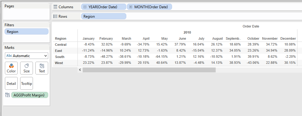
see it on your sheet, click and select the 12 months of 2010 for the Central
region. Your summary card should update and now show that you have selected 12
marks with an average profit margin of 13.86%:
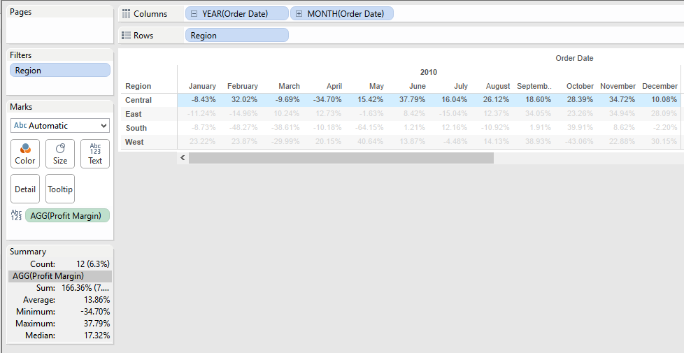
Note - this is a monthly average. What I mean by that is
that we are adding up the percentages from the 12 months and dividing by 12 -
these months are not weighted and this number is not a yearly sum of profit
divided by a yearly sum of sales - that would be a yearly average, and, to
clarify, that’s not what were interested in. Just thought you should know.
So now we know we’re looking for 13.86% in the Central
region for the year 2010. Let’s write our Table Calc. We’re going to leverage the Window_avg
function and we’ll call it “Profit Margin - Win Avg”:

I like to try to keep the base name of the function first
and then add in whatever aspect of the nest that calculated field is. Thus, we
called it “Profit Margin - Win Avg” which should help us group the functions
together and keep things straight going forward. We’ll drag that pill out onto the view of the
sheet, on top of the numbers that are already there, and we should now see two
sets of numbers stacked on top of each other, like this:
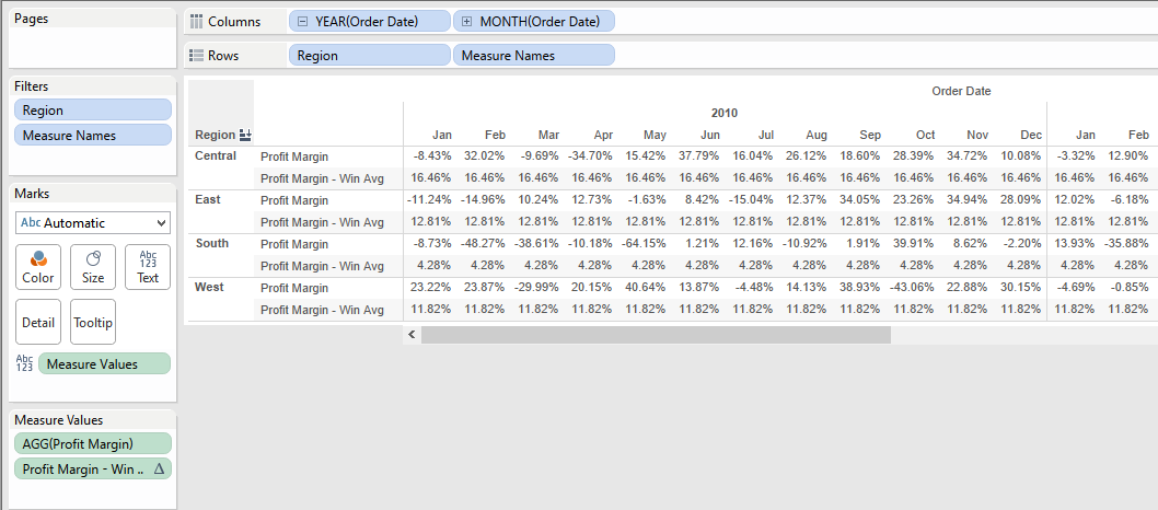
The problem we should notice is that this average is the
same for all months and all years - and it’s not the 13.86% we were expecting.
What we wanted to see was an average that was the same for every month but
restarted every year. In order to get there we click on the pill that is now
located in the measure values and has the triangle on it – the triangle icon is
letting you know that this is a table calculation. We click on it and go down
the menu and hit “Edit Table Calculation” and it brings up the dialog box that
causes trembling and fear in the hearts of even the most advanced Tableau user.
Have no fear amigos, we’ll walk through this together.
Where it currently says “Table (Across)” (which is the
typical default – and rarely what you want to use) click on it and go all the
way down to the last option where it says Advanced. Should now see this:

If you select Month of Order Date and click the arrow to
send it to the right what you’re telling Tableau is “the thing I want you to
average is the Month of Order Date - do this for each year and for each region
(IE when region and year change I want you to restart your average)”. Make sense? Even though there are easier ways
to do it, I always go to the advanced tab on table calculations because I need
to say out loud to myself how I’m planning for Tableau to do this
calculation. I would recommend you do
the same until you become pretty good at it.
Once you apply those changes your sheet should now look like
this, and you will notice we now see correctly that 13.86% is the monthly
average in the Central region for the year 2010. Perfect!

Now let’s head back to the original statement of analysis
we’re working on:
Rank the top five states in each region by year-over-year change in average monthly profit margin.
Well, average monthly profit margin is done so let’s
continue to work backwards - and go after the year-over-year change. This is another table calculation, and
another simple one. But at the same time
it’s also the first one were going to nest the average that we took. So here’s
the tricky part and how we do this: right-click on that first table calculation
we created called “Profit Margin - Win Avg” and select Create Calculated Field.
The new calculated field that we want to create is going to take the current
year average profit margin and subtract it from the prior year average profit
margin. Therefore the table calculation in Tableau we want to use is the lookup
function that looks like this:
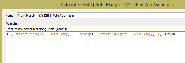
Again, we’re basically telling Tableau to take the
difference between the current Year and the previous year and return the
difference (for multiplying by 100 because these are percentages and we want to
return the difference in the percentages in points - we do this because it’s
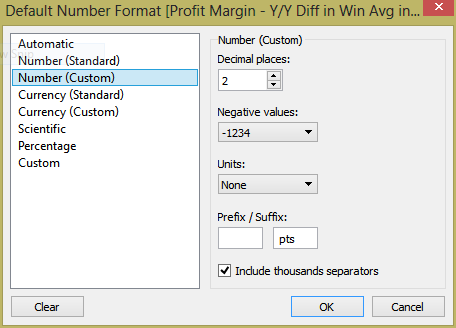
easy to see when we’re right). Once you’ve created that calculated field, right-click
on it and open up the Default Properties>> Number Format and force it to
be a two decimal number with the string “ pts” on the end, like this:
Now, drag that out and placed on top of the other numbers in
the table just like we did before. You
end up seeing a third row of numbers which sort of looks right but mostly have
zeros. Again, we’re going to have to tell Tableau how we want this table
calculation to be calculated. Go back to measure values and click on the third
pill, “Profit Margin – Y/Y Diff…” and hit Edit Table Calculation again. You
should notice a couple things: the default of Table (Across) is back again for
the field we just brought in, but you should also notice we now have the
ability to toggle between two different table calculations at the top. So long
as the first table calculation we did is still in the view, you should see that
if you switch to it it’s already preconfigured using what we gave it in the
steps above. You have the ability to
switch between the two calculated fields because you are now leveraging a
nested table calculation - this is because we leveraged the calculated field of
a table calculation in another calculated field with another table calculation. The power here is that we have the ability to
set the configuration of each table calculation nesting separately, and you
will see that this is very important for what we want to do now.
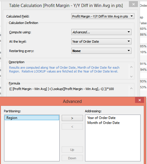
This time we bring over both Year of Order Date and Month of
Order Date, making sure to put Year on top of Month, because once we set that
part of the dialog box will tell the first dialog box we want to do this at the
level of year and we do not want to restart the table calculation. This has the
effect of forcing Tableau to ignore month completely as we do this table
calculation because it is lower than the level of granularity that we are doing
the table calculation. Make sense?
Once we go back to the table, the effect is pretty
obvious. Everything from 2010 is now
gone (which is logical because you’d be subtracting 2010 from 2009 but 2009
doesn’t exist - so it shows up as null). And we now see the same number show up
for all months but different in each of the years 2011, 2012, in 2013 - just as
we expected. AND you’ve now written your
first nested table calc. – you’re the bee’s knee’s!
Alright, let’s take another look at our statement of
analysis we’re working on:
Rank the top five states in each region by year-over-year change in average monthly profit margin.
Before we get to ranking the states, let’s limit the
information that we’re looking at. You
should notice that the data for each year is different, but it’s the same for
every month. Therefore let’s limit our
sheet to looking at only the first month of every year. The easiest way to do this is to create a
test - a true or false Boolean statement – to figure out if we’re looking at
the first month of the year. Of course we can simply write something like
Month(Date)=1, but that’s not a Table Calc., so what fun would that be? Instead we’re going to use a function called
“First” and it goes like this:
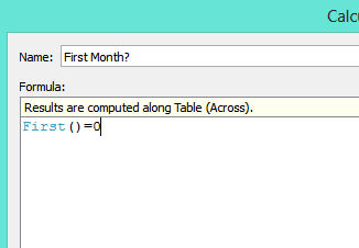
We create a calculated field called “First Month?” and is
going to run a table calculation to figure out if what we’re looking at is the
“first” based on the way we define it.
Notice that once you’ve created this calculated field it’s going to show
up in Measures, not Dimensions even though it is a Boolean and returns true or
false. The reason for this is that table
calculations are always aggregations, and because they’re aggregations they
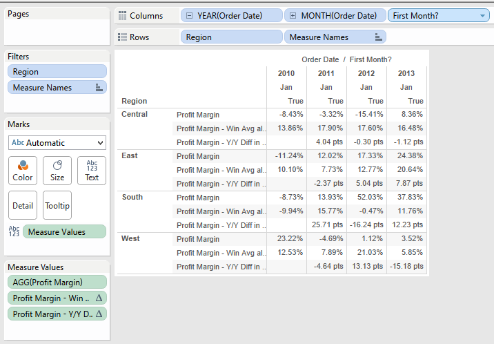
have to show up in Tableau as Measures. We are going to drag this new field
onto the end of the column shelf, and Tableau is now going to label each column
either true or false based on whether or not it’s the first in the column. Therefore, very logically, the first column
appears as true and all the others appear as false. Our goal however is to make
the first month of each year show up as true and the other month as false.
To get there, click on the triangle of the field you just
drag it onto the column shelf, and go down and hit Edit Table Calculation. This
time were going to put year and month to the right side (in that order). After we hit OK, we’re going to configure the
first dialog box to calculate the table calculation at the level of Month of
Order Date, and restarting every Year of Order Date. It should look like this:

Once that is done you should see a few more “trues” showing
up every January. Now, simply right-click on one of the “falses” and select
Hide. Hide is important feature of
Tableau when it comes to table calculations.
If we simply excluded, or filtere out all the other months, it would
change our average to simply be whatever the profit margin was in January. By using hide, the data is not excluded, it
just doesn’t show up, and our averages remain correct. Your sheet should now
look something like this:
We’re getting really close now. Looking back once again at
our original statement of analysis:
Rank the top five states in each region by year-over-year change in average monthly profit margin.
It's time to bring states. In the mapping items hierarchy
click and drag States and drop it onto rows in between Region and Measure
Names. You now have a bunch of rows, one for each of the three measures for
each state that’s in the data. The very
last piece of this analysis is the ability to rank each of those states based
on that year-over-year change so that we can identify the top five, in order,
for each year, for each region. This is where we write our last part of our
nested Table Calc.
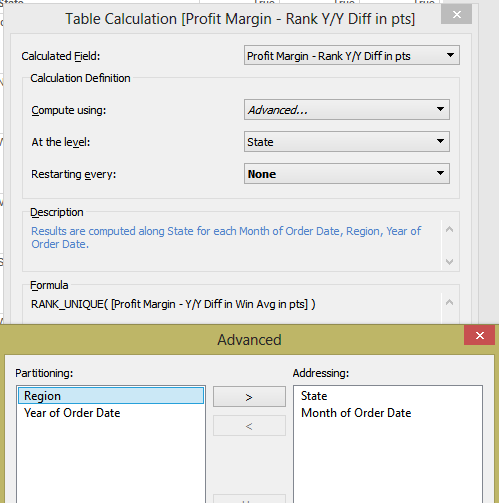
Just as we did before, we’re going to right-click on the
previous calculated field we created and select “Create Calculated Field”. Here we leverage one more table calculation
that we will use in order to rank our year-over-year differences:
Using rank unique guarantees that we’re going to get a
different ranking for every row, even in the event that the numbers were
exactly the same. Before we bring this calculated field into the view,
right-click on it, and about two thirds of the way down, select “Convert to
Discrete” - this is going to force Tableau to write the actual number rank
rather than trying to create a visualization – which it would do if we left it
as a continuous measure. Once you’ve done that, now click and drag that pill
and place it in between Region and State. Again, it's time to open up the
trusty Edit Table Calculation dialog boxes to get this last table calculation
set up for us. At this point you should be a pro at getting these things set
up, but think logically about what we’re looking for here: we want to rank the
states (so address that), we wanted to restart for every year and for every
region (so partition those), and we want to ignore the months (because they are
all the same) - so place Month underneath State in the addressing box. Once that’s all taking care of tell Tableau
that were going to do this At the Level of State. Everything should look like this:
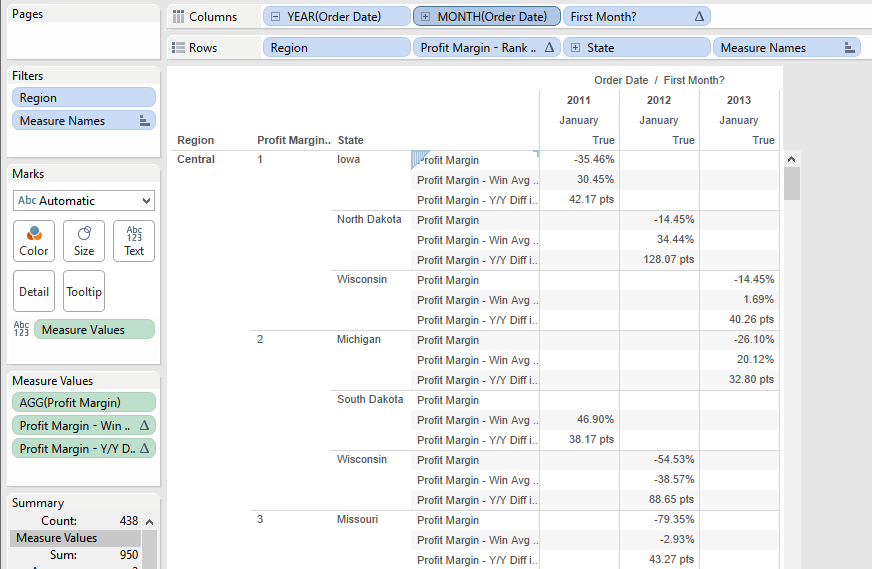
Once this is done you’re going to see some funkiness for
second. The reason for this is that the
ranking of the states that are not in the region that is specified are going to
show up as null, and Tableau puts these at the top. Simply right-click on the word “Null”, and
click hide. Also, hide the year 2010 – we’re not going to care about it anymore
going forward. Now, press Control and
left click and drag the rank function from the rows shelf over to the filter
shelf. By clicking Control before you do this, it has the effect of copying and
pasting the function with all the editions that we have made. When the dialog
box pops up start by clicking “None” and then ticking the boxes for 1, 2, 3, 4
and 5 (because we want to see the top five States for each Region - that’s what
we’re selecting here). Also, you no longer need the first two fields that are
inside the measured values – “Profit Margin” and “Profit Margin – Win Avg”.
Click and remove those two fields and the field “Profit Margin - Y/Y Diff” will
shift up and now reside on the label shelf by itself. At this point are really
close to our final result and you should be seeing something like this:
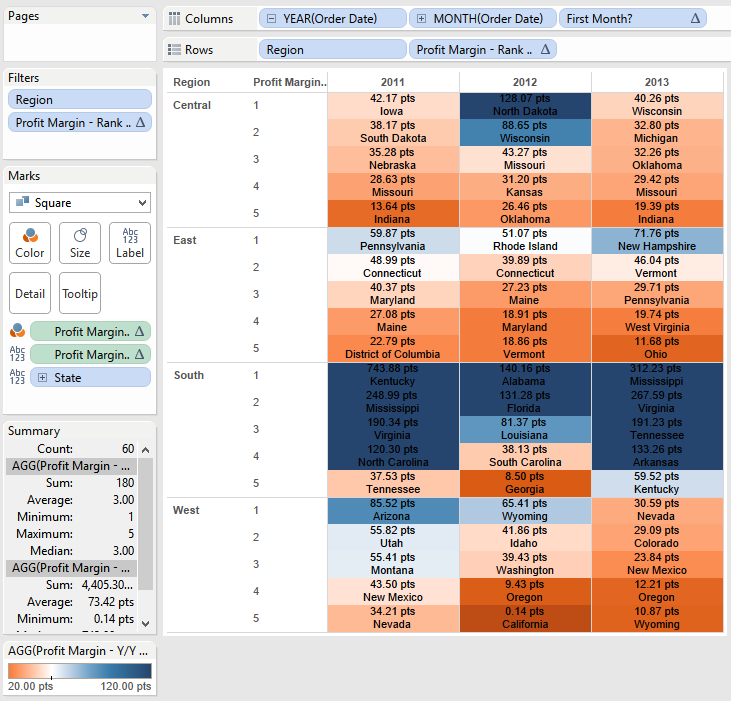
Because we have the State on the Rows Shelf, it's creating a
new row for each of the states that ranks first for each of the years. Therefore, in most cases, were seeing three
rows for every ranking (one for each of the states). To fix this we’re simply
going to take State and move it over to the Label Shelf. Doing that gets is 98%
of the way there:

At this point all we’re going to do is add a little bit of
visualization - this wouldn’t be Tableau without it! Change the mark type to squares and Control, click
and drag the “Profit Margin – Y/Y Diff…” pill from the label shelf to the color
shelf as well. I've use the colorblind diverging color palette and set the
start/center/end at 20/50/120 pts, to get this final view of a heat map
highlighting the best and worst of our top five states for each year. The final product looks like this:
That’s it! You did it! You've created your (possibly first)
nested table calculation in Tableau! They are all really easy just like this :)
Well, maybe not, but now you can begin to see the powerful analysis that nested
table calculations give you the ability to understand. It's worth noting one
last thing - the reason we left each step of the calculation in the view until
the very end was that Tableau uses the configuration for each of the nested
pieces that we had already set up. We could have gone straight to the last
calculated field and brought that in, but we would have had to set each of the other
nested pieces up from scratch, which can be tricky if you can’t see them. Removing
them at the end is how I like to keep things straight.
Congratulations! You’ve made it all the way through this
very long post. I hope you learn something about nesting table calculations.
Thanks as always for stopping by!
Nelson
Very helpful, step by step Nelson. Every time I have to do something like this, I forget how I did it, even in my own past workbooks. Thank-you for a wonderfully detailed reference!
ReplyDeleteKelly - Thanks so much and I totally agree that this can be confusing stuff! So glad you found it helpful!
DeleteThanks for taking the time to walk me through this. Nested Table Calculations are not straightforward. But you shined light on even more than that in this post. Always giving a lotta bit extra and it's greatly appreciated.
ReplyDeleteRobert -
DeleteYou're very welcome my friend. I tried to hit a lot of points so I'm glad they were helpful! Thanks for leaving such a kind note. Many thanks-
Nelson
This comment has been removed by a blog administrator.
ReplyDeleteNelson, great post. It was clean and concise with a commentary that made it enjoyable to read. Well done!
ReplyDeleteCheers,
Josh
WHat could be sum formulae of calculating sum for table down ?
ReplyDeleteThis is an awesome post.Really very informative and creative contents. These concept is a good way to enhance the knowledge.I like it and help me to development very well.Thank you for this brief explanation and very nice information.Well, got a good knowledge.
ReplyDeleteTableau Online Training|
SAS Online Training |
R Programming Online Training|
Great Article. its is very very helpful for all of us and I never get bored while reading your article because, they are becomes a more and more interesting from the starting lines until the end.
ReplyDeleteTableau online training bangalore
Great article..I have some clarity about Table calc.s now but I could recreate exact same Viz as you did. May be I didn't select appropriate fields for addressing and partitioning. Will it be possible for you to share the workbook so that I can validate where I went wrong.
ReplyDelete
ReplyDeletethe blog is about Tableau The Counted (Remix) it is useful for students and tableau Developers for more updates on Tableau follow the link
tableau online training Bangalore
For more info on other technologies go with below links
Python Online Training
ServiceNow Online Training
mulesoft Online Training
Great Article. its is very helpful for all of us and I never get bored while reading your article because, they are becomes a more and more interesting from the starting lines until the end.
ReplyDeleteBig data hadoop online training
ReplyDeleteIt is nice blog Thank you porovide importent information and i am searching for same information to save my time it is useful for all
workday Online Training Hyderabad
Thanks for your informative article.Its very helpful to my business intelliegence.thanks a lot. Tableau Training in Chennai
ReplyDeleteThis comment has been removed by the author.
ReplyDeletenice blog , very helpful and visit us for VISUALIZATION SERVICES in UK
ReplyDeleteWelcome to brotherhood Illuminati where you can become rich famous and popular and your life story we be change totally my name is Harrison I am here to share my testimony on how I join the great brotherhood Illuminati and my life story was change immediately . I was very poor no job and I has no money to even feed and take care of my family I was confuse in life I don’t know what to do I try all my possible best to get money but no one work out for me each day I share tears, I was just looking out my family no money to take care of them until one day I decided to join the great Illuminati , I come across them in the internet I never believe I said let me try I email them.all what they said we happen in my life just started it was like a dream to me they really change my story totally . They give me the sum of $8,000,000 and many thing. through the Illuminati I was able to become rich, and have many industry on my own and become famous and popular in my country , today me and my family is living happily and I am the most happiest man here is the opportunity for you to join the Illuminati and become rich and famous in life and be like other people and you life we be change totally.If you are interested in joining the great brotherhood Illuminati you can contact us. on whatApp ofcall +2348166545531
ReplyDeletei am ERIC BRUNT by name. Greetings to every one that is reading this testimony. I have been rejected by my wife after three(3) years of marriage just because another Man had a spell on her and she left me and the kid to suffer. one day when i was reading through the web, i saw a post on how this spell caster on this address AKHERETEMPLE@gmail.com have help a woman to get back her husband and i gave him a reply to his address and he told me that a man had a spell on my wife and he told me that he will help me and after 3 days that i will have my wife back. i believed him and today i am glad to let you all know that this spell caster have the power to bring lovers back. because i am now happy with my wife. Thanks for helping me Dr Akhere contact him on email: AKHERETEMPLE@gmail.com
ReplyDeleteor
call/whatsapp:+2349057261346
i am ERIC BRUNT by name. Greetings to every one that is reading this testimony. I have been rejected by my wife after three(3) years of marriage just because another Man had a spell on her and she left me and the kid to suffer. one day when i was reading through the web, i saw a post on how this spell caster on this address AKHERETEMPLE@gmail.com have help a woman to get back her husband and i gave him a reply to his address and he told me that a man had a spell on my wife and he told me that he will help me and after 3 days that i will have my wife back. i believed him and today i am glad to let you all know that this spell caster have the power to bring lovers back. because i am now happy with my wife. Thanks for helping me Dr Akhere contact him on email: AKHERETEMPLE@gmail.com
or
call/whatsapp:+2349057261346
My ex-husband and I had always managed to stay friendly after our divorce in February 2017. But I always wanted to get back together with him, All it took was a visit to this spell casters website last December, because my dream was to start a new year with my husband, and live happily with him.. This spell caster requested a specific love spell for me and my husband, and I accepted it. And this powerful spell caster began to work his magic. And 48 hours after this spell caster worked for me, my husband called me back for us to be together again, and he was remorseful for all his wrong deeds. My spell is working because guess what: My “husband” is back and we are making preparations on how to go to court and withdraw our divorce papers ASAP. This is nothing short of a miracle. Thank you Dr Emu for your powerful spells. Words are not enough. here is his Email: emutemple@gmail.com or call/text him on his WhatsApp +2347012841542
ReplyDeleteHe is also able to cast spell like 1: Lottery 2: Conceive 3: Breakup 4: Divorce 5: Cure for all kinds of disease and virus
I read testimonies and reviews about him so I contacted him immediately, explained my problems to him. Same day , he casted a spell for me and assured me for 2 days that my husband will return to me and to my greatest surprise the third day my husband came knocking on my door and begged for forgiveness. I am so happy that my love is back again and not only that, we are about to get married again, he proposed. I wouldn't stop talking about him. Contact him today if you need his help via email: emutemple@gmail.com and you will see that your problem will be solved without any delay. Website: https://emutemple.wordpress.com/ whatsapp number +2347012841542
ReplyDeleteThank you for sharing wonderful information with us to get some idea about it.
ReplyDeleteworkday online course
workday training online
workday software training
Informative Post. I see your post. Thanks for giving me this information. Keep sharing again.
ReplyDeleteAre you looking for Water Damage Restoration Stanwood? In Stanwood, WA, and the surrounding regions, Home in Home Remodel And Repair LLC provides skilled water restoration services. We provide a range of services in Stanwood, including local water damage restoration, smoke and fire damage restoration, biohazard cleanup, mold removal, and more. We've helped a lot of people in and around Stanwood recover from water damage. Please call our toll-free number to engage specialists for water damage restoration right away. We are always 24*7 available to assist you in a possible way.