The "Vizioneer" comes from mashing two words that have shaped my world for most of my adult life - Engineer and [data] Visualizations (or Vizes to those who know what's up). Graduating from first from Oglethorpe University in Atlanta, followed by Georgia Tech with my Bachelors and Masters in Civil Engineering, all of which taught me to think through anything and everything - problem solving, "engineering" solutions, teaching to the "ah ha" moments - is what I love to do. In 2010 that investigative, engineering mindset intersected a job change and a plunge into the world of Data Analysis. In the search for the next great thing I stumbled on to a data visualization and dashboarding product called Tableau software and things just took off. So now I guess you could call me that engineer with the sweet data visualizations - or just "The Vizioneer" :)
In 2013, I joined the incredible team at Slalom, focusing on Tableau and it's been an amazing experience. Recently in 2014, I was honored and humbled to receive Tableau's highest recognition of being named a Tableau Zen Master. Follow along to see what happens next :)
There's some amazing work happening all around us. One of the greatest things about Tableau is the awesome community, and when someone discovers something it's not long before the world hears about it.
Today, I have the pleasure of introducing you to Mark Jacobson, a Slalom Consultant out of the Silicon Valley office. Mark's connected some dots in the Tableau Server Postgres DB repository data model for us, allowing us to better understand how extracts are connected back to their workbooks - something that's really valuable if your Server is overburdened with extract jobs. Check it out!
Connecting the Tableau Server Background Jobs Table back to
Content
If you’ve ever tapped into the Postgres DB
that lies at the heart of Tableau Server, you’ll find that it is
a gold-mine of data about how your users interact with and experience your
Tableau Server. Statistics on everything from how frequently users access
workbooks, when they publish content and how well your server is performing can
be gleaned from this data. And what better way to do that than by hooking up
Tableau directly to get these insights.
Lots of posts have been written about how to access these
tables and Tableau has published a data dictionary
about what you’ll find within. There have also been numerous contributions
from the Tableau Community showing what can be done with this data. Jeffrey
Shaffer, who runs the amazing Tableau Blog data + science, has compiled a list of
these on his Tableau Reference Guide.
Much of my client work is focused on helping organizations
understand what’s going on inside their Tableau Server
platforms. On a recent assignment, I had the challenge of needing to understand
what was causing my client’s Extract Refresh jobs to experience
long delays. I knew that by tapping into the background_jobs
table I’d be able to find my answer.
To see where the delays were, I created a heat map detailing the
delays between the scheduled start time and the actual start time of each job.
This showed me where the bottlenecks were but one piece was still eluding me.
Specifically, I needed to connect the performance of each refresh job back to
the workbook or datasource that was experiencing the delay and then to the
project where it was located.
Looking for a Solution
At first this would seem like an easy task. I would just join the
background_jobs table back to the workbooks table or datasources
table on a common ID field and go on with my analysis. That was until I looked
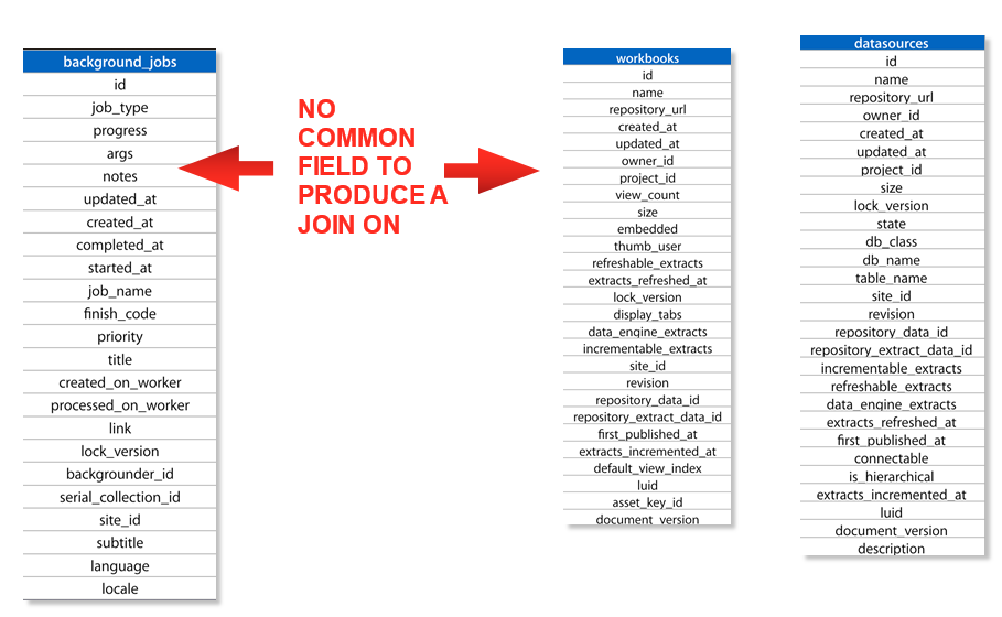
at the contents of these tables. The background jobs table does not
contain a workbook_id or datasource_id like the other tables within the
workgroup schema.
It does contain a “title”
field which has the name value of the content and a “subtitle”
field that displays either “Workbook”
or “Datasource” if the background job is related to an
Extract refresh but this is not unique.
What happens if you have a workbook in 2 different projects with
the same name? How would you know you were getting the job results of the right
workbook? This was indeed my problem so I began to look for a more unique way
to link these tables. After all, Tableau Server has to be able to make this
association so it can perform the desired operation, right?
Discovering the Link
I knew the answer had to be within the background_jobs table, so I went digging. Low and behold, I found my answer within the “args” field. For a Workbook’s Extract Refresh job, the “args” value looks something like this:
---
- Workbook
- 87994
- (string masked for confidentiality)
- 75596
- null
Could one of these values turn out to be the workbook_id or datasource_id I was looking for? Turns out the ID value after “Workbook” is the workbook_id value that will tie back to the workbooks table. Having found the workbook_id, I now needed it in a format that I could use in a join. The next step requires some custom SQL and a little knowledge about regular expressions.
Using the following statement, I was able to parse the “args” string into an object_id:
cast(split_part(
(regexp_replace(args,'---','')),'- ',3
) as integer) as object_id
The statement replaces the dashes and splits the string into its own field which is then cast into an integer so it can be successfully joined with either workbooks.id or datasources.id inside of Tableau’s Data Source editor.
Success! I now had a version of the background_jobs table
complete with the ID of the object being refreshed that I could link back to my
data!
If you’re like me and you’ve
been stuck searching for way to do this, I hope you enjoyed the post. I’ve
created a .tds file and
hosted it on GitHub so you don’t have to recreate the SQL if that’s
not your thing.
Clickable, Drillable Cascading
Dynamic Parameters in Tableau
Dynamic parameters
are a well-documented demand in the Tableau community. The reasons for this are
numerous but most of all simply goes back to better enabling advanced analysis
with a better, more intuitive experience for end users. My experience is no
different. It’s not a problem that I run
into often, but when I run into it, it is a seemingly endless brick wall
between the analysis that I can do and the analysis that I want to do.
Now the solution
that follows solves a fairly specific problem (which we’ll talk about) and is
not intended to be an end-all be-all solve for dynamic parameters (we still
need Tableau on that one). But what I am
going to show you is extremely powerful in the right circumstance - and the
funny thing is that it’s been right in front of our faces all this time.
The solution comes
from an actual client problem that was a bit of a brainteaser for a few hours.
Before I go any further, a big thanks to both Chris Toomey and Allan Walker of
Slalom for allowing me to bounce some ideas off of them, even though I went in
a different direction with this solution. Here’s the situation that were
solving for in the analysis that we want to create:
Working with a
large organization with a five or six step hierarchy, some steps have many
hundreds of members, and the hierarchy cascades very well (ie walking down a
step drastically reduces the pertinent data).
The analysis I want to show is a year-over-year percent change metric
(or maybe a few metrics – sales, profit, cost, etc…), where you can see both
the parent and its relevant children over time AND where the user can either
select a child to drill into (making it a new parent and displaying its
children, one level down in the hierarchy) or clicking and giving the ability
to walk one step back up the hierarchy. Oh, and the client JUST upgraded to
Tableau Server 8.2 (gasp) - so a level of detail calculation is out of scope on
this one.
Did I lose
you? They say a picture is worth 1000
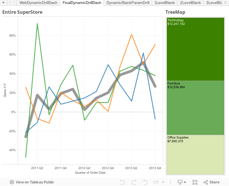
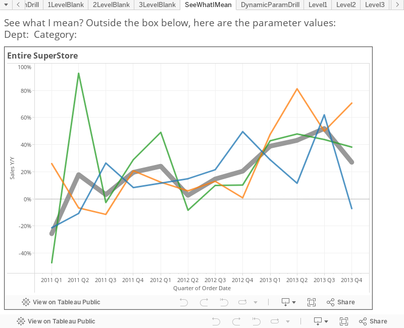
words, so in terms of superstore data here’s an idea what I’m talking about:
As you can see on
the left we’re showing year-over-year change in sales by two different levels
of detail: the thick gray line represents all of superstore, while the three
thinner trend lines represent each of the different departments that make up
superstore (Technology, Furniture, and Office Supplies). Here’s why this is
visually so important - the parent is giving context to the children, so if you
can understand that a parent is down 10% year-over-year, you’ll actually have
admiration for a child that was only off 5% over the same period of time.
Similarly a child that is up 20% year-over-year doesn’t look quite so good when
you realize the parent was up 40% year-over-year. Seeing both levels of detail is
extraordinarily powerful visual analytics especially in very hierarchical
organizations.
Now creating these
views in Tableau at each level of the hierarchy is not especially difficult -
what is extraordinarily difficult is creating the interactive flow and
filtering between these different levels of detail in an intuitive and
excellent user experience. So the
challenge became how can we dive in and out of a piece of the hierarchy without
robbing users of a great experience? I’m glad you asked…
Let’s get a couple
questions out of the way.
Is publishing to Tableau Server or Tableau
Public required for this solution?
Yes, actually it
is. If your organization doesn’t have
Tableau Server and you can’t publish your data to Tableau Public, this isn’t
going to work for you. This hack takes
advantage of a trick with URL parameters, which means it will only work after
the workbook has been published. We’ll
talk about this more in a bit.
Did you say something about dynamic
parameters?
I did and here’s
why - we need to use parameters because we need to know what level of the
hierarchy we need to be on (are we drilling in or going back out?). We also need to use parameters because we
need to hold each of the values that we’ve drilled into the hierarchy (we’re basically
creating a breadcrumb). The easiest way
to understand what I’m talking about is by drilling into the viz below. The simple viz shows how you can leverage
logic based off of parameters to select the correct sheet/level of the
hierarchy as you drill in.
Note: I’m going to
show two different solutions to solve the same problem. This first solution (above) is the lesser of
the two as it has the most ‘gotchas’ and by far the worst user experience -
parameters don’t cascade (or ’show relevant values’ as quick filters can) so by
the time you make your second selection only 1/3 of your choices will actually
produce another visualization. Imagine if each step had dozens of options, they
would be beyond frustrating to get three levels into your hierarchy. Also from
a user experience, if I want to drill into something that interests me I want
to do it by clicking on or hovering over that piece of data. Having to select where to drill via a
drop-down takes me out of the analytic ‘flow’ that Tableau wants me to be in.
But it totally
works - if you have the patience for it. But I’m here to save your patience by
giving you another solution via…
DYNAMIC PARAMETERS!!!
This is actually
shockingly simple, so don’t blink as you might miss it. It actually comes from knowing a little bit
about how URL parameters work. You may
have used these before to create some customize links, or if you have ever
written a blog or embedded a dashboard inside of a webpage you tend to learn a
thing or two on this. And Tableau’s
documentation is very clear on how these work:
Here we learn
first about how we can set parameters in our workbook by putting that value
into the URL, like so (parameters and parameter
values in purple):
and just a little
bit farther down from there we come to find out that we can also set field
values from our data or calculated fields in a similar way (calc fields and field values in
orange):
These are both
very interesting pieces of information but neither is extraordinarily
groundbreaking. The question that I’ve never seen anyone ask is what happens if
I take a parameter value and set equal to a field value - from the examples
above something like this:
By Joe that’s
crazy! If only there was an easy way to do that :) Well of course there is -
it’s our dear friend the URL action. You see making a URL action with a link
that looks like the following would actually create the URL you saw above:
By the way - if
you’ve always wondered what the checkbox on URL actions that says ‘URL Encode
Data Values’ was all about, now is your time to find out, because you
definitely want to check the box when you go with this solution. It’s what handles funny characters like
spaces when you have to put them into a URL.
Here’s some more details if you’re curious:
So what we’re
saying is you can dynamically set the value of the parameter by clicking on
point in the data and using a URL action to set the parameter equal to the
point in the data. They are dynamic
because you set their values when you click on them. They are cascading because of the filter logic
you’re using on each sheet that shows the relevant data for the current level of
the hierarchy. And they’re drillable
both in and out (we’ll show you how in a bit).
Thus, ladies and gentlemen – I give you:
CLICKABLE, DRILLABLE CASCADING
DYNAMIC PARAMETERS IN TABLEAU!!!
I know - where has
this been all my life?
I’m now going to
walk you through how I built a second, more elegant solution which leverages
this URL parameter hack using super store sales data. One big thing to note
before we get started – In the first solution we created two parameters that were
both LISTS of strings based on the values of Department and Category from the
data. In the solution that follows (and
in your solution) I recommend blank string parameters that can be set to ANY
value to accomplish the functionality we’re going to discuss here. The
advantage is that, of course as your data changes there is no need to update
some list of parameters in your workbook.
Also note that you don’t need to create a parameter for the lowest level
of the hierarchy, which in my example is Item (Remember SuperStore is Department>>Category>>Item).
The How-To
To begin we need
to create three sheets, one at each of the hierarchy used that we care about.
Remember the goal of the view the hierarchy is to show two levels at a time - a
single parent and all of its associated children. Also note that in each
example were looking at a year-over-year change (by quarters if you’re
following along with me). I’ll show you how to make the first one, and the
other two you can make following the exact same methodology.
First we’ll create
our year-over-year metric - it’s a Table Calc using the lookup function. We’re
going to compare the current value to the one from four quarters prior and take
the percent difference:
Once that calc
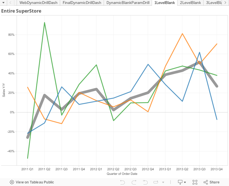
field is created it’s time to make the first view – this will be Y/Y change in
Sales (by quarter and Table Calc using the default of Table Across
(Quarter[Order Date])) at the first two levels of detail: Total SuperStore (one thick grey line) and by
Department (three colorful thin lines). Leveraging
a dual axis (don’t forget to sync them) at those two different levels of detail
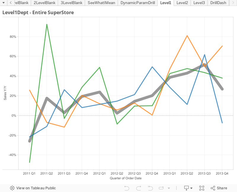
and it should look something like this:
Note the two
different levels of detail in each of the dual axis:
Got it?
Perfect. You’re done creating the first
level. Add in any additional
formatting/tool tip cleanup and then duplicate the sheet. I’ve called this
first sheet ‘1LevelBlank’ so that I know it’s the first level in my drill down.
In the duplicated
sheet (‘2LevelBlank’) drill down one level of detail on both of the dual axis –
meaning the axis that showed Total Superstore now shows the level of
Department, and the axis that originally Department now goes to Category. Now given that we haven’t talked about filtering
yet, you’re looking at about 20 lines (3 Departments and 17 Categories). It’s a mess.
Don’t worry, we’ll fix it. Go
ahead and duplicate it one more time (‘3LevelBlank’), this time taking the two
different levels of detail down to Category and Item (the lowest level for our
example). If you thought the 3
Departments and 17 Categories were a mess, then this is an absolute
disaster. Again, don’t worry, we’re
about to fix it. Now that our three sheets are created, let’s go ahead and
create our parameters and filters.
Parameters and Filtering
As noted earlier,
the easiest thing to do is to create two blank string parameters and set their
default values to be blank. In this
example, I’ve named the two parameters: 1DeptBlankParam and 2CategoryBlankParam. Here’s an example:
Creating the
filtering is really simple as well. We’re simply going to match the parameters
we created above up with the fields from the data. Here’s an example:
Now, the first sheet,
‘1LevelBlank’, doesn’t require any filtering, so let’s head to the sheet on the
second level, ‘2LevelBlank’. On the
filter shelf add the filter we just created where [1DeptBlankParam]=[Department]. Because the parameter is blank, set the filter
to exclude False (ends up doing the same as keeping only True).
Go to the last
sheet, ‘3LevelBlank’, and add the filter for [2CategoryBlankParam]=[Category]. Filter it the same as before, excluding False. When adding the filter on sheets 2 and 3,
they should disappear – if they don’t it’s because your blank parameters aren’t
really blank. To test if you’ve done
everything right, show the ‘1DeptBlankParam’ parameter and type in ‘Technology’
– you should see some lines show up on the 2LevelBlank Sheet. If that worked, type in ‘Copiers and Fax’ in
to the ‘2CategoryBlankParam’ parameter – and you should see some lines show up
on the 3LevelBlank Sheet. Once you’ve both
successfully, clear both parameters and move on to the hack that brings it all
together.
The Hack
Now, you’re all
probably very familiar with the fact that you can create actions on dashboards. Should this be news to you, please go and
check out Peter Gilk’s great post on Dashboard Actions http://paintbynumbersblog.blogspot.com/2014/10/a-rough-guide-to-tableau-dashboard.html
- well done and rather comprehensive.
The interesting thing that most people don’t know is that basically all
of these same actions dashboard actions can be done in the worksheet view. Since we’re all about trying new things, we’ll
take this road less traveled and add some worksheet actions.
We’ve already
discussed that URL Actions are going to play a key role, so on the first sheet,
1LevelBlank, go up to the top and select Worksheet>>Actions
You’ll be greeted
by a very similar action menu that should look very familiar. Click Add Action>>URL. This is where we get fancy. Since we’re going to create a ‘run on menu’
action, the name of the action is what will show up at the bottom of our
tooltip. In the name field, type: ‘Drill
in to ’ and then click on the arrow at the end.
Here, select ‘Department’ which will show the value of the Department
you’re hovered over.
Select only the
current sheet in the check boxes, 1LevelBlank.
Head to the URL
tab and paste in the following (we’ll dissect it next):
There’s a lot
going on here so let’s talk about each piece so that you understand it. Understanding all of this is very important
because this is how you make it both clickable and dynamic so that everything
works.
This is nothing
more than the URL address of sheet ‘2LevelBlank’ on the server. Remember, you’ll be on the highest level of
the hierarchy on sheet ‘1LevelBlank’, so this is going to move you to a
different sheet one level down in the hierarchy. The easiest way to get this URL right is to
publish the workbook (either to Tableau Server or to Tableau Public, like I’m
doing here). The format is clear:
http://<server>/views/<workbook>/<sheet>
So you should be
able to plug in your values and go.
They’re all
specified here: http://onlinehelp.tableau.com/current/server/en-us/help.htm#embed_list.htm
The ? means we’re
going to add some details (parameters) to the URL. The : that follows it means that
the detail is for how to render on the server (without the :, shows that we’re
setting a value in the workbook either as a filter or parameter – which we’ll
do at the end of this).
:showVizHome=no
This gets rid of
the header at the top of the viz (that is now rather large in v9). Here’s an explination by the famous Ben Jones
of Tableau Public. https://public.tableau.com/s/blog/2014/03/how-fix-your-iframe
&
It means there something
else I want to add to the URL. Separate
each ‘detail’ parameter in the URL with this ‘&’.
:embed=y
‘Required for URL
parameter. Hides the top navigation area, making the view blend into your web
page better.’ When they say required,
they really mean some of the other URL parameters won’t even work if this isn’t
included. Obvious, but worth mentioning.
:tabs=no
Hides tabs, even
if you tick the box in the publishing dialog to show the tabs (which you should
do in this case).
:linktarget=_self
Specifies he
target window name for external hyperlinks.
There’s two options here – ‘_self’ which we use here means open in the
same window/tab; the other option ‘_blank’ would open the URL in a new
window/tab. Using this will re-spin the viz in the same window/tab, which is
the user experience we are looking for.
As we addressed
back in the beginning, the trick that we are doing here is setting the
parameter ‘1DeptBlankParam’ to be equal to the department that we click on in
the viz. Here’s what that looks like
when we add in purple for the name of the parameter
and orange for the
field value from the data:
1DeptBlankParam=<Department>
In the last piece
we are simply reminding Tableau that we want the second parameter to remain
blank. You should now understand all of the pieces of the URL that we’ve
created.
Lastly, to the box
for ‘URL Encode Data Values’ - this should properly encode any spaces, commas,
and other special characters that are in the data. It is very important that you check this box.
Here’s what
everything should look like:
Now, here’s what
the drill in URL menu action for the next level down on sheet ‘2LevelBlank’
looks like – the only changes are in bold at the end:
What we are doing
here is going to a different sheet one step down in the hierarchy (‘3the
Department parameter is holding the value that we gave it in the first drill
down (we’re reminding it of the value we set it to in the first drill down),
while we are setting the value for the category parameter based off the
category that we’re clicking on in the viz (just as we did before with
Department, one level up). If you have
additional levels in your hierarchy, you would simply continue creating URLs
where the previous parameters would hold their values, the current level would
set the value of the parameter, and lower levels would remain blank.
Great – now how do
I go back up the hierarchy?
If you’re at the
bottom level of the hierarch on sheet ‘3LevelBlank’ (which is where you’d be
after the step above), then you’d want to do two things: 1) Go to the sheet one
step above in the hierarchy (in this case ‘2LevelBlank’ and 2) Clear the
parameter ‘2CategoryBlankParam’ while holding the value of the first parameter ‘1DeptBlankParam’. All you have to do is create a URL that does
exactly that:
Now we could
simple publish the tabs, and the interactions would pretty much work, but the
user would be heading to a different URL with every click. This isn’t a winning formula. Instead, we’re going to create a dashboard
and put the whole flow inside of it.
This way it’s easily accessible from Tableau Server.
It’s easier than
you think – Create a new dashboard and name it whatever you want (mine is
called DynamicBlankParamDrill).
Add a web page
object and let it take up the entire dashboard. When prompted for the URL, put
in the URL for the highest level, with blank parameters:
First off, you’ve
just created a dashboard with a dynamic parameter! Wahoo!
Now we should
talk. If you’ve made this far and you
understand everything we did then you’ve probably already realized some things:
1)Using
this method as outlined requires you to create a different sheet for every
level of the hierarchy – This is less than optimal if there are many levels/layers
in your organization’s hierarchy.
2)You
can only dynamically drill in and out of one sheet at a time. This is because you can only send a URL to
one web page object on a Dashboard.
3)If you’ve
played around with the dashboard, you may have figured out that the dynamic
setting of a parameter in the web page object doesn’t extend to other parts of
the dashboard. What I mean is that if
you have the parameters on the dashboard and the web page embedded – the parameters
are only being updated in the web page object, not outside of it. Think of movies like Inception or The Matrix –
The experience was inside, while the person existed outside. This is no different – Even though I can show
the parameters existing on the dashboard, the experience is inside the web
object – and they don’t really tie together at all.
Now those seem
like big limitations – and they are. But
you can actually overcome them all. Here’s
how:
Advanced Jedi Tricks
At the client
where I put this together, I needed to not only be able to go up and down the
hierarchy in a sheet, I needed to create a complex dashboard with multiple
sheets. I also had six levels to go up
and down – so there was no way I was going to create six highly complicated
dashboards, with all the actions and sheet placement, and then reference each
one in the URL. I would have gone
insane. Now that you understand the
basic framework from above – and I walk through that basic example in detail so
that this advanced use makes sense – I’ll talk about how I make this work on a
complex Dashboard.
Parent and Child Dimensions, Filtering,
and URL Fields
What you need to
be able to do on the fly is to know – based on the parameters I have values for
– what level of the hierarchy am I on?
If you know what level you should be on then you can set four very
important things that drive everything:
1) The Parent Level 2) The Children Level 3) The Filter 4) The URL Fields
If you go this
route and use logic based on the parameters, then you can create a single sheet
that can set itself to the correct level of the hierarchy.
Basically we test
the parameters to see if they’re blank.
To do this we use the LEN() function (returns a number as the length of
a string based of the number of characters) and it looks like this:
Len([1DeptBlankParam])=0
and
Len([2CategoryBlankParam])=0
Now if this is
true, we’re at the highest level.
Because there’s three levels to our hierarchy, we’d do this twice more:
Len([1DeptBlankParam])>0
and
Len([2CategoryBlankParam])=0
This puts us one
level down. And….
Len([1DeptBlankParam])>0
and
Len([2CategoryBlankParam])>0
Puts us at the
bottom level. Create each as its own
calculated field – it will save you some time later. If your hierarchy has more levels then build
as many of these as you need.
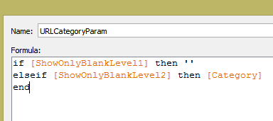
Now we’re going to
create Children Dimension – We’re basically going to say ‘when we’re at
x-level, that means y-field is the correct spot in the hierarchy’. It’s
actually very simple:
if [ShowOnlyBlankLevel1] then [Department]
elseif [ShowOnlyBlankLevel2]
then [Category]
elseif [ShowOnlyBlankLevel3]
then [Item]
end
The Parent Dim is
just like it, except one level up on the hierarchy:
The last thing we
need to do is build the filtering. This
is slightly tricky, but you’ll get it quickly:
Now, here’s the
awesome thing – You can build as many sheets as you want! Just make sure you use the Parent and
Children Dimensions for your slicing and filter everything on the filter we
just created.
When you bring
everything in to a dashboard everything will be based on the parameters as they
are set. You’ll create dashboard actions
(so that you can apply them to multiple sheets, rather than just one at a time)
for the URL links. Note: Instead of referencing different sheets as you did
before, you will reference this same dashboard view in the URL – only the
Parameters in the URL will change.
This brings up to
the last bit of trick-er-a-tion: You’re
URL has to be dynamically created, which means for every click you’re going to
set each value, just as we did before. But it was easier before because we
manually made the URL based on the sheet we were on, but we don’t have that luxury
now that everything comes from the same sheet.
So – We have to create fields that do this for us and then call those
fields on any sheet that needs the ability to drill.
I’m sure that was confusing.
It will make sense in a minute.
The goal here is
to tell the parameters what value they should be set to on a click. So on a drill in click going from Level 1 to
Level 2, the Dept param should be changed to the Dept that was clicked. When going from Level 2 to Level 3, the Dept
param should hold it’s value. Here’s how
to write that:
At the same time, on
a drill in click going from Level 1 to Level 2, the Category param should remain
blank. But when going from Level 2 to Level
3, the Category param should should be changed to the Category that was clicked. And here’s how to write that:
Now, you’re going
to need to call those values in the URL, so take both fields and add then to
the Tooltip on the ‘All’ marks card:
I’ve also added
the way to drill back out (download to see it).
Almost done!
Dashboard time – Create a new dashboard (Mine is called ‘FinalDynamicDrillDash’). Set the size of the dashboard to Automatic
and bring in the sheet you just created.
Click on Dashboard actions and select URL Actions.
We’re going to do
just as we did before with some moderate tweaks. The URL is going to be self-referencing and
the parameter values are coming from the fields you just created. It looks like this (note the bold parts:
You’re done with
that dashboard for the moment. Just as
we did before, create one last dashboard with just a single web object. When asked for the starting URL, use the one
from above, but remove the parameter fields (we want them to be blank when it
loads). It should look like this:
To prove out the
dashboard concept I added a Tree Map sheet as well and allow the user to select
either sheet to drill in.
Here’s the final product:
I can’t believe
you made it all the way through this post.
Thanks for hanging out. Hopefully
you’ve learned a couple things. The
Analysis that you can do with this is incredibly powerful! So go out and change the world with your
dynamic parameters in Tableau!
Hello everyone, I’m Chris Toomey. I work with Nelson at Slalom and he has
kindly let me borrow his blog for the day.
If you haven’t guessed already, this post is my entry into the Wiki Data Contest.
For those of you who don’t know (or maybe forgot) – every
year Tableau hosts a series of themed competitions to select competitors to the
Iron Viz Championship. The first is all
about finding data on Wikipedia and make a viz out of it. I’ve been reading comics since I was 10 and
thought it would be cool to chart the History of Marvel Comics.
In developing this viz, I came to appreciate how just how
much Tableau’s technical depth supports the creative process. There were many sources of inspiration, both
technical and creative, and their work deserves mention.
Jonathan
Hickman – Writer for the Avengers and mastermind behind Marvel’s upcoming
“Secret Wars” event. His visual style is
fantastic, and his storytelling is even better.
A primary theme in his work is the notion of circularity – think
concentric circles and time travel. If
you decide to open up his Avengers #1, this is one of the first things you will
see:
Jer Thorp – Co-founder
of the Office for Creative Research, former NYU professor, and from 2010-2012,
the Data Artist in Residence at the New York Times. In 2012, he published a visual history of the
Avengers, a selection of which can be seen below. If you want to see master work in data
visualization, read his stuff.
Bora Beran
– Program Manager at Tableau, where he focuses on statistics and calculation
features, query generation and technical partnerships. Bora’s post on radial
treemaps was what gave me the confidence that I could take what I’d seen in
the work of Hickman and Thorp and translate it to Tableau.
There is also much more Marvel-related background, but
you’ll need to explore the viz to find it!
Getting the Data
While the specifics of the competition make it appear that
you can simply CTRL-C + CTRL-V your way to a fabulous Wikipedia data set, the
reality is much more cumbersome. After
working the design basics out in my handy notebook (paper still has its uses!),
I knew exactly what kind of data I wanted.
This meant that I had to manually cut, paste, clean, and format the
data. It may not have been the most
elegant solution, but it gave me the exact data structure that I needed to
start.
Once I
had all my data, it still needed some polish so I turned to Alteryx.In Alteryx I was able to shape, sort,
aggregate, join, and union my way to a Tableau-usable dataset, without the pain
of doing it all in Excel.In a few
instances I needed subsets of the data to serve as inputs or lookups.Instead of writing that data out once, and
bringing it back in as a full input, I kept it all inside the tool (which is
why you see two sets of text inputs).
Here’s
how that trick works: insert a Browse tool into the workflow where you want to
pull out data. Once the workflow has
run, open the Browse window and click the
icon in the top right and select “All Data with
Headers.” Then right-click anywhere in
the workflow and select “Paste”. The
data will now be a Text Input and keeps everything self-contained.
Design Notes and
Community Musings
I knew that circles were going to be the dominant part of my
viz, so I needed to brush up on my trigonometry. To do so I spent some time dissecting Steven
Carter’s wonderful Adoption Gap
visualization, and playing around on the Desmos Graphing Calculator. Desmos is a wonderful tool for writing and
comparing any type of function. Simply
start typing and it will do the equation formatting for you, hit Enter and
you’ve got a graph. Very handy for
benchmarking equations, particularly SIN and COS.
Once I had my basic math down, I visited Bora Beran’s radial
treemap post. The third of his three
examples shows a radial bar chart - which I knew was the basic model I wanted
for my viz.
I first replicated
his design using my data – his methods require using a data densification trick
that relies on binning and unions. It’s
handy and got me most of the way there.
I just needed each bar (representing a character/team pair) to be offset
by the number of months from time zero that they joined their respective
team. I’d like to say that I came up
with a magic trig method to do this – but it simply came down to changing or
adding one variable at a time and seeing what happened. Desmos was particular helpful here as I could
make multiple equations and compare then quickly.
Here’s the solution: Inside of the SIN/COS functions, I
added the following:
DiffFromStart is a field I calculated in Alteryx that does a
DateDiff from each characters JoinDate and the first date in the dataset. I’m calculating it at the team+character
level, SUM(DiffFromStart) is the same as the unaggregated value. I wrapped it in a RUNNING_AVG to account for
densification – I didn’t want that value to change just because Tableau created
new points. Finally, the WINDOW_MAX represents the amount of the circle I’m
actually playing with. The result is
that I can push the polygon around the circle and keep it aligned
properly.
It is important to note that with the introduction of the
“Spin the Wheel” filter, which operates before all the Table Calculations, this
introduces some odd variations in arc length and position. The values don’t change, but they move around
in unexpected ways – which makes all the interactions all the more fun, you
simply don’t know what’s coming!
Final Polish
The last thing I needed to do was finalize the formatting. A
black background gives the colors the most pop, and I used Tableau 9’s handy
hex color values to create consistent palettes.
The final piece was fonts – I spent so much time on the viz that I didn’t
want to be undone by unreadable text.
Here’s the links to the best Tableau font resources I could find:
There are a number of other tricks to get the tooltips to
function the way I wanted, but I’ll spare you the details and let you all pull
things apart.
That’s it! Thanks to Nelson for loaning me his space, and
thanks to you all for taking the time to read and interact with my work – I
hope you enjoy using it as much as I enjoyed building it.
I’m active on Twitter, but the link to my LinkedIn page is
on my Tableau Public profile – so feel free to reach out with comments,
questions, or if you just want to talk comics.
I’m also at all the Seattle Tableau User Group events, and will be at
TC15 in October.