

For those of you with much experience in Tableau, I'm going to go ahead and answer the voice inside your head that as you read this will say, "That's not the only way to do that". That's correct. There's many ways to do this trick. There's always many ways to do a trick - Pick a card, any card (see what I mean?). But this is a simple way to handle tricky filtering.
Here's the set up. I have population data on all fifty states in the in the US. I want to show it in a map, but I only want to show the lower 48 (it fills up the window better and who really cares what people it Hawaii think anyway!?!?). Problem is when I click to filter and then unclick to un-filter to show all, the state filter where I excluded Alaska and Hawaii also disappears and the map returns to show everything, and I'm left with a killer view of the Pacific Ocean right in the middle of my window. What I want to happen is that my exclusion of Alaska and Hawaii will remain, regardless of the filtering being done as a result of actions on the dashboard. We have a dashboard that looks like this (showing Alaska and Hawaii in the bar chart but excluded in the map):

So here's what I've seen done before (and then we're going to do a trick): Once you have the visualization(s)/dashboard created, right click on your data source and select duplicate.

Now, in the duplicated data source bring "State" on to the filters shelf of the sheet with the map. Hit the "Exclude" check box, and check off Alaska and Hawaii.

Now, the the map should update and show only the lower 48. Now right click on the filter in the filters shelf and click Apply to Worksheets>>Selected Worksheets, and now check off all the other sheets in the dashboard you wish to apply this filter.
Now when you select a state and then deselect it, you keep only the lower 48. Pretty neat huh?
"But Nelson, I'm looking at 30 Million rows of data. Do I really need to duplicate the whole thing?" Of course not! Here comes today's trick. Instead of duplicating the entire primary data source, create a new sheet with just the field you want to do the blend filtering on. For the state example it would look like this:

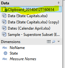
Now, select Worksheet>>Copy>>Crosstab. You now have this data sitting on your clipboard. Simple hit CTRL+V and Tableau will paste that data into your workbook as a data source - you'll see it up there at the top left, starts with "Clipboard...."
The great thing is how small this data is. It's only the number of distinct rows in your data (So 50 rows for fifty states :)). Now, I'll use this clipboard data as my blended data set and follow the same steps as above.
Now that's a trick. I've posted two versions of the same dashboard, one using the blended data as the filter, the other with a normal filter, so you can see the issue I described with the normal filter:

Thanks as always for stopping by.
Nelson
Nelson, I think there's an easier way to do what you want. Why not just duplicate the field "State" and use this duplicate field to handle Alaska and Hawaii? Then when you perform the Action using the State fitler, resetting does not clear the exclusion settings?
ReplyDeleteJust tried it and it works like a champ. Great idea. Maybe I should write a blog post on... nevermind :)
ReplyDeleteThis comment has been removed by the author.
ReplyDeletenice blog , very helpful and visit us for VISUALIZATION SERVICES in UK
ReplyDelete