
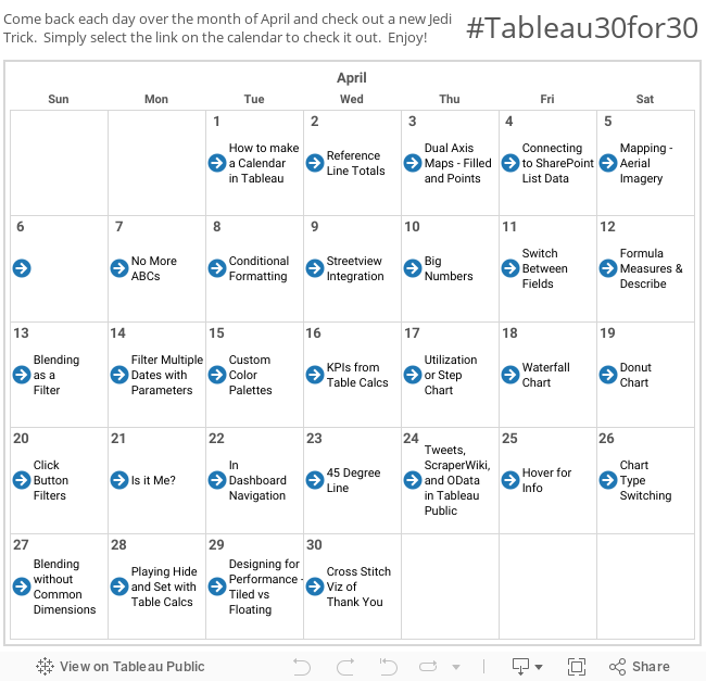
As an avid sports fan, I could not have been more jealous and disappointed in myself that I was not clever enough to come up with the idea for Tableau 30 for 30 on my own. Imagine my excitement when my colleague, Nelson Davis, asked me if I would be interested in writing a guest post. I quickly accepted with one condition… I had to be able to write an article on my absolute favorite Tableau trick of all time. This one comes with a disclaimer people, your audience’s mind WILL be blown, so use it carefully. Today I’ll be showing you how you can use a parameter to switch between worksheet types in your dashboard. This one has been covered elsewhere, but no list of Tableau tips is complete without it! I was first introduced to it over at Alan Smithee Presents, check out his blog here: http://www.alansmitheepresents.org/2014_03_01_archive.html
Your first step will be to create a couple of worksheets. In my example, I've just used the Superstore data set to create a simple bar chart and bullet chart showing the relationship between sales and profits by region. Feel free to create whatever worksheets you want, the steps will be the same. You may just want to replace “Bar” and “Bullet” with values that make more sense for what you've created.
After throwing together a couple worksheets, create the parameter below:

Place your worksheets on a dashboard and make sure the worksheets are in a vertical container. I’m using a black border to show the container and how both worksheets should fit inside.

Here comes the magic. You will now create a calculated field that takes your Chart Type Selector as an input. The formula below is a quick and easy way to create your calculated field.
CASE [Chart Type Selector]
WHEN 'Bar' THEN 'Bar'
WHEN 'Bullet' THEN 'Bullet'
END
Edit: Zen Master Mark Jackson pointed out that the Case Statement isn't necessary. The same thing would be accomplished creating a calculated field that simply contained the parameter, as below:
[Chart Type Selector]
Great catch Mark!
Now, on your bullet chart, right click on your “Chart Type Selector” parameter and select “Show Parameter Control”. Set the value to “Bullet” and drag your “Chart Filter” field to the filter pane and check “Bullet”. Do the same for your bar graph work sheet, set your parameter to “Bar” and then add “Chart Filter” to the filter pane and check “Bar.”
Your bullet chart should now be completely blank and your bar chart should show up normally. Exactly why this works can be a little confusing without taking a look at the underlying data. The below screenshot shows the resulting data when the parameter control is set to “Bar”. You can see that when you select “Bar” in your parameter the values for the Chart Filter field become “Bar” for all records. Because you filtered for “Bullet” on your bullet chart, there’s nothing for that worksheet to show!

After you've added your filters, go back to your dashboard. If your parameter control is
still on “Bar” it should look something like this:

Now I know what you’re thinking…Steven this looks ridiculous and I hate you! Settle down folks, we’re not done yet. This step is the easiest, but probably most commonly missed thing I see with people implementing the chart selector. Click on both of your worksheets and check for that rascal of a tack. Clicking the tack will take away “Fixed Height” from your worksheet and allow it to resize automatically.
After setting your worksheets to resize it should look something like this:

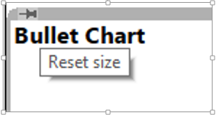
This still looks a little bit ridiculous, we don’t want to see the “Bullet Chart” title when it is not selected. Right click on the title and click “Hide Title”. If you don’t want a title to ever show, then do the same for bar chart. If you want the title to reflect your parameter choice, double click on the title of your top worksheet and enter something like the following:
Superstore Sales <Parameters.Chart Type Selector> Chart
If you’ve done everything properly, you should have a dashboard that allows your user to select how they want to see the data. Notice that the color legend is even nice enough to disappear when viewing the bullet chart!


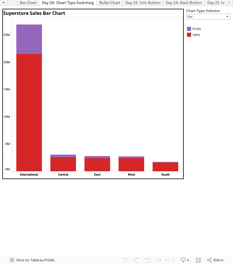
This is a useful trick for sure, but don’t get too carried away with it. Each worksheet leaves about 5 pixels of blank space when it is not selected. This is pretty subtle when using 2-3 worksheets, but can become more obvious as you add worksheets to the container.
For more tips and tricks like this, please check out my blog at http://mmviz.blogspot.com. You can see the chart selector in action on my “Road to the National Championship” viz here: http://mmviz.blogspot.com/2013_12_01_archive.html. Notice that the y-axis in ranking worksheets are in ascending order, while the rest are in descending order. Also, I show a % for the Time of Possession charts. Three different worksheets and you wouldn't even notice if I hadn't told you!
Hope you all enjoyed today’s tip and come back to see what else Nelson has in store for you in the rest of his Tableau 30 for 30.
Thanks for checking us out. Hasta Manana!
Nelson
This comment has been removed by the author.
ReplyDeleteHi Nelson. Your posts are very interesting and useful. But when I am trying this visualization, the chart filter(calculated field) is showing only the Current value which the parameter(Chart Type Selector) is holding. It is showing either bullet or bar but not both. Can you help in this?
ReplyDeleteI read testimonies and reviews about him so I contacted him immediately, explained my problems to him. Same day , he casted a spell for me and assured me for 2 days that my husband will return to me and to my greatest surprise the third day my husband came knocking on my door and begged for forgiveness. I am so happy that my love is back again and not only that, we are about to get married again, he proposed. I wouldn't stop talking about him. Contact him today if you need his help via email: emutemple@gmail.com and you will see that your problem will be solved without any delay. Website: https://emutemple.wordpress.com/ whatsapp number +2347012841542
ReplyDelete