
Before we get into it, you should know that this trick will work with any type of visualization - Maps, Bar Charts, Line Charts, Packed Bubbles, Tree Maps, etc.... As an aside, we'll chat more on switching to different visualizations later in the month, as well.
As for today, let's get going. Here we go with the Superstore again. We're going to do two different uses of this, starting with the simpler of the two.
We're going to start by creating a parameter. Once you understand a little bit about parameters, you begin to realize they're super powerful. They exist outside of your data sets (and are therefore not dependant on the data). They are leveraged when you create a calculated field and include the parameter to interact with the data. It's a bit tough to explain the theory - You'll see in a minute what I'm talking about.
The first thing we're going to do is a create a string parameter. Right click on a measure and select "Create Parameter", the title of which is going to be "Measure Switch". Now we're going to give the user the ability to switch between three different measures. Therefore we're going to create a list of three smartly named parameters. On the left side is the actual value of the parameter (the value that will be referenced in the upcoming calculated field), and the right side is the pretty name that the user clicking on the parameter will see. Fill it out like so:

Awesome. Now, as we said before in order to leverage the parameter we have to create a calculated field. Our calculated field is going to be a statement that looks the parameter, and based on the value will pick a metric to show in the visualization. Here's what it looks like:

I've chosen to include the aggregation along with the measure. You don't have to do this, but if you don't, the default is that Tableau will to choose to SUM on yourbehalf - Just FYI.
Now, it's viz time. Throw "Region" on rows and "Department" columns and now add your newly calculated field "Switched Measures" to columns. Also add it to the color and text shelf, add some formatting and voila (changes based on the different parameter values):


So there's a simple example of using a case statement and parameter to give the end user more control over a bar chart. But as we said this can be used on all sorts of visualizations. Maps included. So we're going to give it whirl as well. Big thanks to Will Jones and the Interworks team for the spark for this idea.
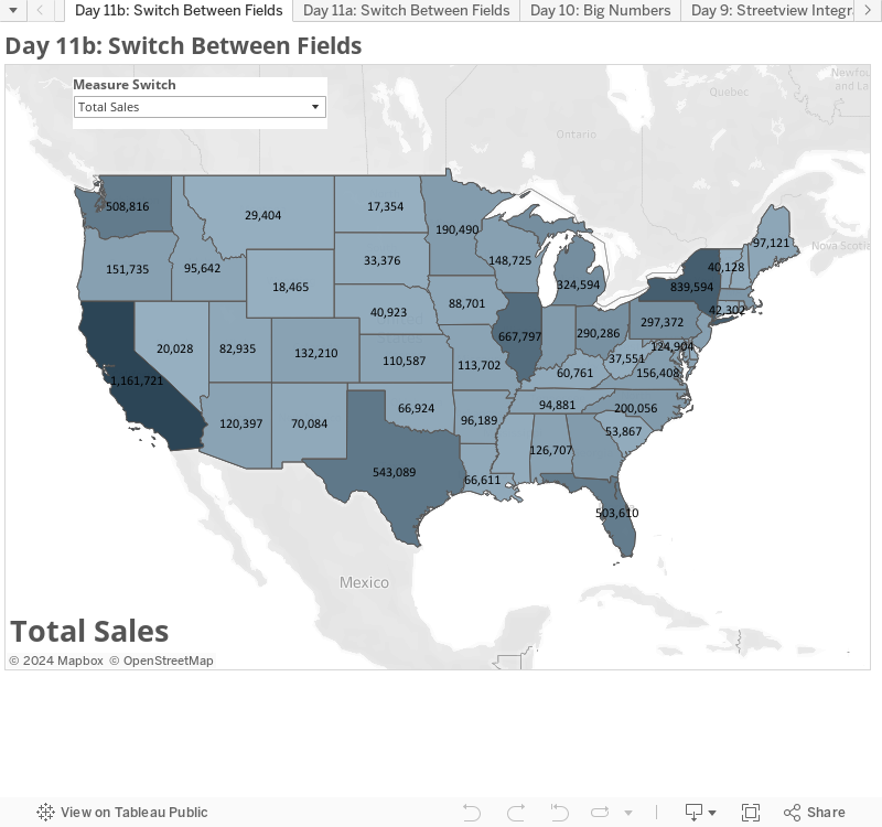
New sheet. Change the marks to filled map and double click "State". We're going to eventually create a dual axis map, so go ahead and Ctrl Click Duplicate Latitude on the rows shelf, and it should be looking like this:

On the marks shelf, click the top map and add the parameter we made "Measure Switch" to the colors shelf. Now click the map below that one - add the calculated field we made "Switched Measures" to the text and color shelf, change the color to the gray to black palette, and click on color to change the transparency a little more than 50%. Lastly, right click on that second pill on the rows self and set to dual axis. Here's what it looks like:

That's it! Thanks for following along.
Nelson
Thanks, super useful. It's these kind of case/iifs parameter/calculated field tutorials that are the elevator to next level tableau skills after you've mastered the basics. Keep em coming :o)
ReplyDeleteVictor - Just saw your note! Thanks so much, and I couldn't agree more - much of this is what will take your skills to the next level. Thanks for following along!
DeleteI love your blog :) As a recent graduate of Data Analytics, I am trying to create my own blog/webpage around analytics/viz and this is an inspiration!
ReplyDeleteUpasana - Thanks so much for your note and good luck with the blog. I've learned so much through so many different people so it's a noble endeavor! Many thanks!
DeleteHey Nelson,
ReplyDeleteI am trying to do this but want to filter on a dimension rather than a measure? I am using a table and want the user to filter on different levels of geography (i.e. State Electorate, Local Government Area and Health District ... each of these have value). How could I do this?
In doing this, I noticed that some of my measures that I have custom formats on "M" or "B" for millions or billions of dollars, do not render that way on the map. In another worksheet, a data table shows those formats, but the map, with a filter, parameter for these measures renders the whole number instead of the shorter M or B format I defined the measure as.
ReplyDeleteThis comment has been removed by the author.
ReplyDeletenice blog , very helpful and visit us for VISUALIZATION SERVICES in UK
ReplyDelete