
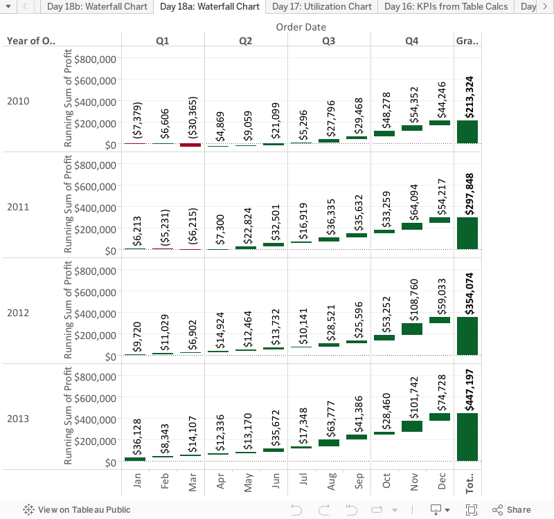
"How did we get here?" It's a great question. Back on Day 10 we talked about big numbers, how sometimes there's only one number that matters. Today we're going to take the opposite approach to deliver on the question - "It's great that that's my total, but how did we get there?". A waterfall chart is one of the best ways to unpack a large number and to break it down into digestible bites - maybe by organizational unit (very common) or by time period (also common, but less typically for a waterfall chart). Today we'll show examples of both, and dig into the nuts and bolts of how to look at this by organizational unit. By showing each individual unit, it's much easier to get a sense of comparison and maintain context with the data (ie "Office Machines only had a $7k profit in the South Region compared to $101k in the Central Region, but total profit in the South was much less than Central so it's not as bad as it sounds...". A waterfall chart can help visually give that insight (a particularly good choice for showing Profit by different slices). I thought it was helpful to see the end result before we started yesterday, so before we get going, here's where we're headed:

I've been speaking a lot of Spanish a work recently, so in that spirit - Vamos por Superstore Data (aka we're going to use the Superstore data set again, so go ahead and open it up)!
This is a pretty cool trick and actually rather simple. Think about what's happening in the visualization - the total creeps up with each slice as a running sum, but only the sum of that slice is shown as the size of that bar. This is how it works in general. Today we're going to look at Profit broken down by Department and then Catagory.
To start off, go ahead and change the mark type to a Gantt Chart. Toss Department on the Columns shelf and Profit on the Rows shelf. You should be here:

Interesting. Now here comes the trick in two parts. The first part is that, per the way we described it above, this needs to be a running sum of Profit so that we can see how each piece impacts the overall total. So go ahead and right click Profit and select Quick Table Calculation>>Running Total. Ok, now we need to create the size of each slice of Profit, so intuitively we are going to throw Profit on the size shelf. Hold on there cowboy. If we did that we'd get this non-sense:

I don't even know what that is, except all kinds of wrong. Rather - and here's the second part of the trick - we need the size of Profit to fill downward not update (as it's doing above). Therefore we're going to create a calculated field called "Profit - Negative" with this formula:
SUM( [Profit] )*-1
Now if we place this new calculated field on the size shelf we go this much more intuitive visualization:

Each piece picks up where the other left off. It's pretty cool. So you've actually already completed creating a waterfall chart (ta-da!), but let's take it the extra mile and do a bit more. First I want to see the total so on the top go to Analysis>>Totals>>Show Row Grand Total (we know we should select Rows because our measure is on the Rows Shelf). Next on the Columns shelf, Department is part of a hierarchy. Click the plus sign (+) to see the next level of detail, which is Catagory. Now it's starting to get interesting:

I want to be able to quickly see if something is profitable, so now I will use profit and drag it to the colors shelf. Since rules a made to be broken, I'll stick with this red-green diverging palette (Whaaaa? Christmas in April?), but I don't want this gradient - either be green or be red, but be all in! In order to do this simply, click on the color legend>>Edit Colors. Check the box that says Stepped Color and take the number down to 2. Now click advanced on the bottom right and check the box next to the word "Center" and make sure that number is 0. Everything looks like this:

Two more things - put Profit on the Text Shelf and add Region to the Rows Shelf (it's a more detailed view). A little formatting here and there and...

Look at you! Making waterfall charts! Water fallin' out of control! For fun I've also included an example of doing a waterfall chart using months of the year. It's another interesting example (see below - What's up with Q1?):
We that's it. 18 down. We'll be here all weekend. Tell you're friends! Thanks for hanging out!
Nelson
Chers amis, nous avons récemment rénové notre nouvelle maison, mais la sélection d'une tête convenable vraiment dur. Ma sœur m'a dit que beaucoup de familles utilisent maintenant Robinet LED, mais je crains était la vie ne tarde pas. Je préfère encore les antique robinets, Mitigeur douche et Accessoires salle de bain sont une bonne lecture. Je vous souhaite une expérience d'un ami peut me donner quelques conseils. Merci.
ReplyDelete
ReplyDeletethe blog is about Tableau The Counted (Remix) it is useful for students and tableau Developers for more updates on Tableau follow the link
tableau online training Bangalore
For more info on other technologies go with below links
Python Online Training
ServiceNow Online Training
mulesoft Online Training
Hey very nice blog! I enjoy reading through your article post, I wanted to write a little comment to support you and wish you a good continuation. All the best for all your blogging efforts. Tableau provides a complete range of chart styles. You really don’t even have to understand why a particular chart is better. If you rely on the show me button, tableau will provide an appropriate chart based on the combination of measures and dimensions you’ve selected.
ReplyDeleteLearn complete details about chart types in Tableau
The advanced chart types in tableau
Hi There,
ReplyDeleteI love all the posts, I really enjoyed.
I would like more information about this, because it is very nice., Thanks for sharing.
During my time at Mule Soft, I’ve had a lot of conversations with people from other companies about their specific challenges and one recurring theme is almost always present:
the conversation starts out talking about point-to-point integrations. It’s pretty natural when presented with two systems to want to draw a connection The data here is needed there and, after that, we’re done because a problem was solved.
THANK YOU!! This saved my butt today, I’m immensely grateful.
Obrigado,
Heena
Hello There,
ReplyDeleteLove it absolutely! So crystalline. No mumbo jumbo. No non-sense. Straight and simple. You guys need a standing ovation for your good work.
We launched the program back in July with the goal of gathering MuleSoft aficionados across the globe, along with curious developers willing to learn more about Anypoint Platform. In only 6 months, we launched more than 50 groups, and that’s just the beginning.
I read multiple articles and watched many videos about how to use this tool - and was still confused! Your instructions were easy to understand and made the process simple.
Obrigado,
Morgan
Halo,
ReplyDeleteAllow me to show my gratitude bloggers. You guys are like unicorns. Never seen but always spreading magic. Your content is yummy. So satisfied.
What is the difference between web APIs and web services? Let’s start off with an analogy: all tigers are cats but not all cats are tigers. In a similar way, all web services are APIs, but not all APIs are web services. Web APIs and web services are often confused with each other; however, web APIs are an evolution of web services. Both facilitate information transfer, but web APIs are more dynamic than web services are.
Thanks a lot. This was a perfect step-by-step guide. Don’t think it could have been done better.
Kind Regards,
Hi Nelson Davis ,
ReplyDeleteGasping at your brilliance! Thanks a tonne for sharing all that content. Can’t stop reading. Honestly!
Software is losing its magic. We simply demand too much from the current approaches. As a result, software developers are losing the battle with complexity, often without realizing it. More often than not, little failures pile on top of other little failures, and life for the consumer, as well as the business, becomes more frustrating rather than easier.
I started using Mulesoft tutorial blog for my training practice.
Excellent tutorials - very easy to understand with all the details. I hope you will continue to provide more such tutorials.
Obrigado,
Morgan
ReplyDeleteGreat post dear. It definitely has increased my knowledge on Tableau. Please keep sharing similar write ups of yours. You can check this too for Tableau tutorial as i have recorded this recently on Tableau. and i'm sure it will be helpful to you.https://www.youtube.com/watch?v=Ny6h82Qy4tA&t=34s
Very clear explanation. Please share more like that..
ReplyDeleteRPA Training in Hyderabad
Nice and good article. It is very useful for me to learn and understand easily. Thanks for sharing your valuable information and time. Please keep updating mulesoft online course hyderabad
ReplyDeleteThis is very nice blog it helps me a lot and i have to seen recently one weblink about python online tutorial provide SVR Technologies.
ReplyDeletemulesoft esb interview questions
Get all the guidance that you need to learn tableau with the help of online tableau certification courses
ReplyDelete