
So here's the goal. We have our actual and our target of (pick your flavor of measure/metric - today mine is) Margin. A donut chart shows what percentage of your way to the target you are (or if you're over target, it shows that too). Again, here's an example and where we're heading today:

To get there we're going to need to create three calculated fields, and leverage the dual axis solution from a little while ago. If you're ready let's get going.
Today we're switching to the Sample Coffee Chain data (because it's day 19 and I need the caffeine). The coffee chain data has a number of different metrics with actuals and budgets, the prefect use case for a donut chart. Since we're going to have to create three calculated fields, let's start there.
The first is going to give us the percent of Actual vs Target (logically named "Margin - Percent of Budget"):

The next thing we have to calculate is the remaining amount to get 100% of the budget. Now, if we knew that the data would allow you to go over budget, then this calculation is as simple as:
1-SUM( [Margin] )/SUM([Budget Margin] )
However, if there's anything I've learned from the government since of the time of Bill Clinton, it's that budgets are often exceeded. If that becomes the case for us, then this deficit number needs to zero. Thus we have to write a sightly more complicated calculation:

Since we've already walked down the path of going over budget, we need to calculate that piece as well. Similar to the calculation above, there is no excess if the actual/budget is less than 100%, so we'll turn the alligator mouth around to make this zero when there's a deficit. Here's the other thing - this still has to work if you go over 200% of target. So with all that in mind here's how we calculated the excess:

Int() basically acts a floor function, and returns only the amount above x00%. Lastly, we need to create one more field to be a place holder. I always go will a field called "One" which is equal to (you guessed it) 1.
Ok, let's get to vizzing. Grab the last field we created, "One" and throw it on columns twice. By default, it's going to show the SUM(One) so right click and change each to be a dimension. Next, right click the second of the two and make it a dual axis. You should now have something that looks like this:

The first "One" is going to become a pie chart. I know, it's painful for me too, but that's what it takes to make a donut chart. So select it and change the mark type to pie. Now we're going to take Measure Names and put it on the Filters shelf, and select the three measure you created first (for me this is: Margin - Percent of Budget, Margin - Percent of Budget Remained, and Margin - Percent Extra). Also add Measure Names to the color shelf, and finish this part off by adding Measure Values to the Angle Shelf. Should now look something like this:

Now for the second "One" - this need to become a circle mark type. Once you've switched that, bring the "Percent of Budget" calculation in and put it on the Label Shelf and change the alignment of it from auto-auto to center-center (all this time I've been it the Text Shelf - learn something new every day). Click on size and decrease it until it's about half the size of the pie chart. Click on color and turn it white. Should look something like this:

Clean up the formatting (Uncheck show header on both "One"s, get rid of the zero line, click color shelf and add a borders to both the circle and the pie chart, etc....). Last thing I'll do is put "Product" up there on the Columns Shelf, so I can see examples where there's both excess and deficit. And...

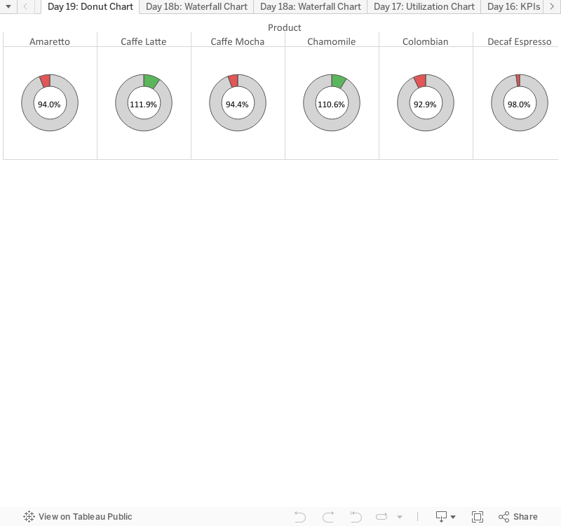
Ta-da! Donut charts! That was a fun one. Makes me hungry. Thanks always for hanging out!
Nelson
Thanks for the tutorial -- I've come to appreciate donut charts over the past few months.
ReplyDeleteOne thing's been driving nuts though: how do you get rid of the zero lines on the produced charts?
I've been banging my head against the wall for two days trying to figure it out...
Riccardo -
ReplyDeleteSorry for not getting back to you until now. In the event you're still needing to figure this out, the Zero Lines can be removed by going to the Formating pane. Go to the last tab (the paintbrush) and the second from the top is Zero Lines - change it to 'None'.
I hope that helps! Thanks for checking out the blog!
Nelson
No worries. Turns out I managed to find a way to hack around zero lines for donut charts, but I encountered them in another context where they weren't so easy to get rid off. Never thought of looking that deep in the Formatting pane, so thanks much for the pointer!
DeleteHi,
DeleteHow to avoid fading of inner circle in pie while selecting out ring
could you please explain how to build half-donut charts in tableau
ReplyDelete
ReplyDeleteIt is really a great work and the way in which you are sharing the knowledge is excellent.Tableau Training in Chennai
This comment has been removed by the author.
ReplyDeleteThis comment has been removed by the author.
ReplyDeleteI read testimonies and reviews about him so I contacted him immediately, explained my problems to him. Same day , he casted a spell for me and assured me for 2 days that my husband will return to me and to my greatest surprise the third day my husband came knocking on my door and begged for forgiveness. I am so happy that my love is back again and not only that, we are about to get married again, he proposed. I wouldn't stop talking about him. Contact him today if you need his help via email: emutemple@gmail.com and you will see that your problem will be solved without any delay. Website: https://emutemple.wordpress.com/ whatsapp number +2347012841542
ReplyDelete