
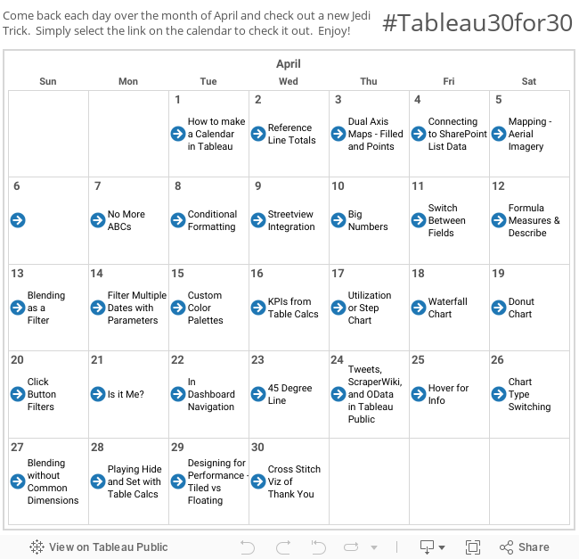
Today (and for many of our days together) we'll be connection to everyone's favorite - the Superstore Excel dataset that comes prepackaged with Tableau. We'll do this because it ensures that we're all starting from pretty much the same place. So go ahead and connect to the data and we'll get started.
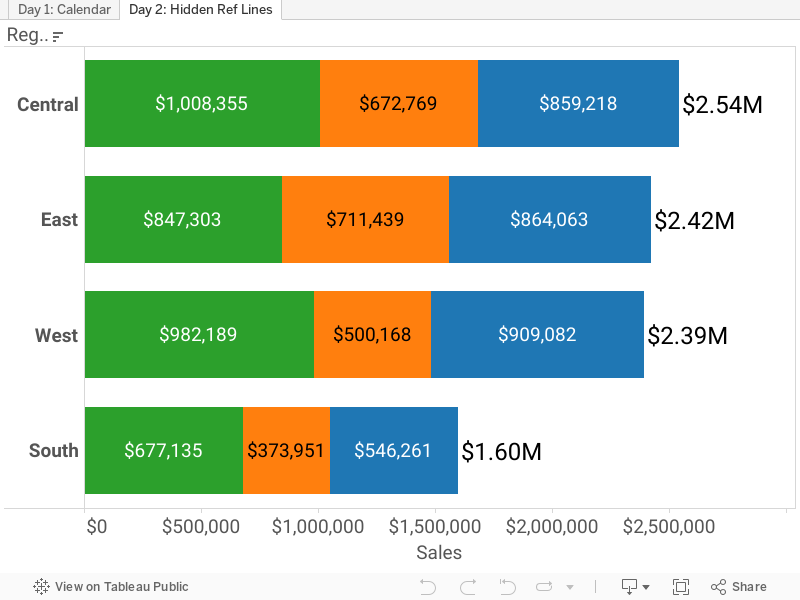
We're going to do a basic example that illustrates this trick. Take "Region" and place it on the rows shelf, and "Sales" on the Columns shelf. Next add "Department" on the Colors shelf, and finally add "Sales" again to the text shelf. You're viz should look something like this:

Now here's the fun part. Without adding the three Department sales together, what's the sum of sales for each region? Sure you could take Department off the color shelf and see the total again, but now you've lost the breakdown we're currently looking at. That's a non-starter, as I want to present more information, not less.
So here's the trick. Right click on the X-Axis and select "Add reference line, band or box". You should now be looking at a popup box that looks like this:

Here's the goal. Rather than creating an actual reference "line" we're going to make a hidden line with visible text, and the text will show the total sum of Sales for each of the regions. Cool huh?
To do this enter the settings you see above.
Click "Per Cell"
Value: "Sum(Sales)"
Aggregation: "Sum"
Label: "Value"
Line: "None" (this is done so that the line doesn't show, only the text showing the value of the total sum)
When you're done you'll now see the totals at the end of each bar. It's likely that you'll need to do a bit more formating to get the text looking the way you want it. So right click one of the reference line numbers, and select "Format". My preference is to have right justification in the middle of the bar, but do as you see fit. You could make the text larger, or change the units (maybe set it to $ Millions).
And the final product looks something like this:

And there you have it! Simple but helpful, just as any good hack should be.
I hope you found this one helpful. If so, I'd love to hear about it. We're just getting started, so come back soon!
Many thanks -
Nelson
Nice hack. I've done similar using a dual axis with a circle shape and then making the circle transparent and adding a label. Going to give this one a try.
ReplyDeleteYep. That's the other way to do this. Both great solutions. Thanks for sharing that one as well!
Deletereat Article. Thank you for sharing! Really an awesome post for every one.
DeleteIEEE Final Year projects Project Centers in India are consistently sought after. Final Year Students Projects take a shot at them to improve their aptitudes, while specialists like the enjoyment in interfering with innovation. For experts, it's an alternate ball game through and through. Smaller than expected IEEE Final Year project centers ground for all fragments of CSE & IT engineers hoping to assemble. Final Year Projects for CSE It gives you tips and rules that is progressively critical to consider while choosing any final year project point.
JavaScript Online Training in India
JavaScript Training in India
The Angular Training covers a wide range of topics including Components, Angular Directives, Angular Services, Pipes, security fundamentals, Routing, and Angular programmability. The new Angular TRaining will lay the foundation you need to specialise in Single Page Application developer. Angular Training
Nelson: Nice tricks and very interesting blog. Johnathan Drummey, in a community forum, did similar trick to sync dual axis across multiple sheets on the dashboard using hidden reference lines and wanted to share that with you. Check this out at http://community.tableausoftware.com/thread/139697
ReplyDeleteJust wanted to say thanks again for this. I keep coming back to this over and over again to help clean up numbers on busy dashboards. HUGE help!
ReplyDeleteThanks Brian! Glad it's helpful!
DeleteWow, superb article you have written!!!! Very Informative and very useful to me. And am very glad to read your blog form starting to the end. Please keep on sharing.
ReplyDeleteTableau Online Training
nice blog , very helpful and visit us for VISUALIZATION SERVICES in UK
ReplyDelete
ReplyDeletenice....
category/advocate-resume
category/agriculture-forestry-fishing
category/android-developer-resume
category/assistant-professor-resume
category/chartered-accountant-resume
category/database-resume
category/design-engineer-resume
category/developer-resume
category/engineer-resume
category/entrepreneur-and-financial-services-resume