
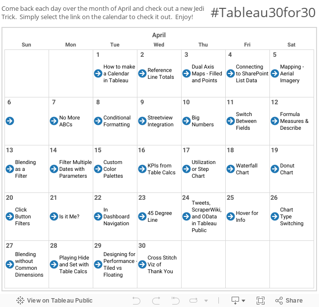
Ah mapping. It's simple, it's easy, often times a double click away. But there are occasions when we need to take mapping to the next level. So let's dig in.
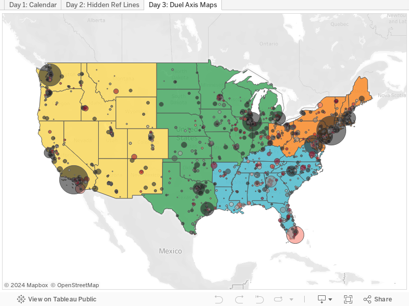
The business problem is that the US is broken into four regions based on state, and the end user wants to look at profitability by city. Either one of those maps is pretty quick and easy to make in Tableau. Problem is they want to be able to look at both region by state and profitability by city at the same time. Dual axis maps to the rescue!
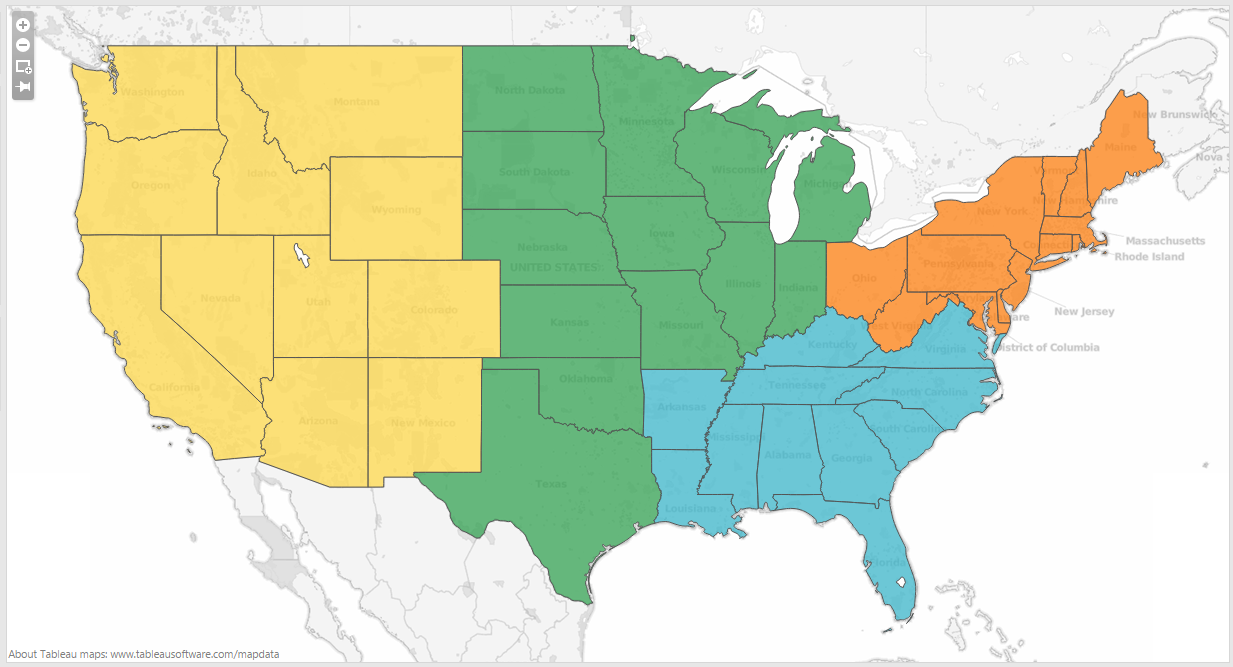
To start, let's show how to make each map individually, and then we'll bring them together. Regions by state is up first. We'll be using the Superstore dataset again today. On a blank sheet start by double clicking "State". Tableau knows that this is geospatial data (as evidenced by the globe next to the word "State"), so double clicking automatically brings up a map with points. Change the chart type to a filled map, drop "Region" on the colors shelf (I switched to Green-Orange 6 Palette), and boom:
I'll duplicate this sheet and start charging after profitability by city. I'll start by hitting the "+" on state to take the next step down on the location hierarchy to city. I'll ok the warning that filled maps doesn't work with cities, and switch the chart type to circles. I'm done with "Regions" for the moment, so I'll remove it from the colors shelf and replace it with "Profit". To avoid the Christmas theme (it's April, remember?) I'll click on the color legend and switch to red-black diverging (red is bad and black is good!). Lastly, I'll bring "Sale" and drop it on the size shelf. I now have a map showing a circle each of my cities, the size of which show total sales and colored by whether or not it's profitable. It'll look something like this:

Two maps, both helpful. Now that we know how to create each one let's bring them together. Hop back over to your first map (filled by region) and duplicate it again. We'll start with this one as we'll want the cities on top of the states/regions.
And here comes the hack. Hold down Ctrl and click and drag the Latitude pill on the rows shelf to create a duplicate one next to it. You should now have two of the exact same maps right next to each other.

Right click that second pill you just created and select "Dual Axis" - now it goes back to one map. But actually it's two identical maps stacked on top of each other. Each of those stacked maps is independent of the other when it come to what you put on the shelf. Each of the stacked items shows up where the marks are. We'll click on the bottom one and change what's on the shelves to be the same setup as our profitability by city was:

If you've got it all right you should now have your dual axis map showing both region by state and profitability by city at the same time!

Boom! Hope found that helpful! If so, let me know. Many thanks!
Nelson
Excellent, Thank you Nelson.
ReplyDeleteYour welcome Ashok! Thanks for checking it out!
ReplyDeleteDear Nelson,
DeleteIt's helpful! Can we create a filled map with line charts instead of pie charts in this way? Is that possible?
That was extremely helpful, and very easy to duplicate. Much appreciated!
ReplyDeleteThanks Dave! Glad it helped!
DeleteHi Nelson, great stuff throughout the blog! I have a question about dual axis maps which i'm hoping you can answer. I am trying to create a dual axis map using two data sources, the first using tableau-generated lat longs to create a filled map view color coded by a metric, the second using a 3 column flat file that has store name, lat, and long to plot store locations on a map using their actual lat longs. I can create either map separately, but when i try to use your process above to combine them, things don't work out. do you have any suggestions?
ReplyDeleteHey George -
DeleteI've tried a couple things but I can't seem to get it either. Send me a workbook and I'll see what I can do.
That would be awesome - i've got a version packaged up, but not sure how to send to you?
DeleteThis comment has been removed by the author.
DeleteGreat blog Nelson, I've learned a lot from your daily jedi tricks and it has been a big help in me learning the software. So I followed your steps to learn how to make a dual axis map however I want to do something a little different with mine. I was able to map the US into 17 districts as a filled map and then on top of that I have the states. What I want to be able to do is click on each district and it display the data, much like what tableau does for each state. However my districts usually include multiple states and sometimes only parts of a state. Is there a trick to turn my filled map into a polygon map? Thanks!
ReplyDeleteWill -
DeleteHave you made the polygons in Tableau or in something else? If in Tableau, I need a better explanation of what you're looking to do exactly. Many thanks-
Nelson
Will -
DeleteHave you made the polygons in Tableau or in something else? If in Tableau, I need a better explanation of what you're looking to do exactly. Many thanks-
Nelson
Nelson,
ReplyDeleteThanks for the example. I am looking to do something similar as George above. Is it possible to create a similar map using Lat Long data in place of City?
Here is a link to a small sample file I am working with. I can create a filled map using the County field and I can plot the lat long points for each ID on a second map, just like you did with region and city. I just am not sure how to combine them into one map. Not sure if this is possible with Tableau?
https://onedrive.live.com/redir?resid=4FE1B6EF77ABD282!29364&authkey=!ADtfkWo0wqm37cI&ithint=file%2cxlsx
Dan,
DeleteI'm in a similar situation where I'm trying to plot lat/long dot plots on top of a heat map (filled by a population parameter at the county level). Long story short, I'm having trouble getting the lat/long file to merge with the map - did you have any success here? Thanks,
Dmitri
Hi,
DeleteDid anyone ever discover a solution to this scenario? I'm working on a similar problem using Excel and SalesForce.com. I have agency locations by zipcode in SalesForce and eligibility data by county in Excel. I'd like to overlay the locations onto a filled map of eligibility.
I could work around this by downloading the agency list from Salesforce and loading it into Excel but the Excel file is rather large as it is and this would be much more efficient.
Thanks!
Sabrina
https://help.tableau.com/current/pro/desktop/en-us/maps_dualaxis.htm#custom
DeleteNelson,
ReplyDeleteGreat exercises! Thanks for all the hard work you put in. With the version of Tableau Desktop 9.2, they have a couple of "Superstores". So sometimes your current directions don't line up. For example with 9.2, I actually had to duplicate the Profitability by Region (second map) instead because I used the Sample - Superstore instead of the Global Superstore. I also had to create the Country, State, City hierarchy.
Thanks a lot for this post. This kind of info can't be found even in Tableau DB.
ReplyDeleteThis was extremely helpful! Thank you!
ReplyDeleteAwesome - Glad it was helpful!
DeleteThis has helped me lots! One question. What if the data source in this example, didn't cover all 50 states?
ReplyDeleteMy problem is I have an excel file i created to map states to regions. I have data coming in from a teradata db for my actual values. I can't seem to blend, append, merge or anything of the sort - correctly in tableau. I've read up on this and it appears like I need to supply a single data source for this to work?
Nelson, I see that this string of comments is quite old by now but I just came across this posting and it helped me howevever I have a question about displaying a tool tip of the "country name". I have two fields in tableau taht I used to create the dual map "citizenship1" and "citizenship2", but now when I hover over the countries themselves I cannot see the text label of the country name. Is this not possible because of the dual axis of the maps?
ReplyDeleteWow, superb article you have written!!!! Very Informative and very useful to me. And am very glad to read your blog form starting to the end. Please keep on sharing.
ReplyDeleteTableau Online Training In Pune, Noida, Hyderabad.
This comment has been removed by the author.
ReplyDelete