

One of the things I said at the outset was that I was going to give credit where credit where it was due. I can remember the first time I saw this beautiful/hideous sheet by Jonathan Drummey (Tableau Zen Master at Southern Maine Medical Center):

I was left feeling something like "I'd never make that, but I'd love to know how he did it. His workbook is here and it's probably still the best reference/example of how to do this trick. If this is something you'd like to learn more about, I highly encourage you to download his workbook and dig into it. BTW - he made this using Tableau 6.0 and 6.1 - just goes to show that a) he's a stud and b) anything's possible with Tableau when you have the following mindset when faced with a problem (from a presentation of his):
Step 1: There's a problem. Your solution didn't work:

Step 2: Think of another solution:

I'm going to show two examples. The first doesn't require the hack and the second one does, but are a version of conditional formating.
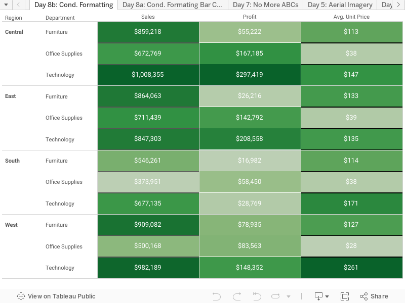
The first example, bar charts, doesn't require the hack. I include it so you know when the hack is and isn't required (and why). Let's hop back on to the SuperStore bus and dive in. I'll throw a couple dimensions (Region and Department) on to the row shelf and a few measures (Sales, Profit and Unit Price) on to the columns shelf. Its should like something like this:

Doing conditional formating with bar chart is pretty straight forward. On the left side, on the marks self we have "All" which would do conditioning for "All" of the three measures (we won't touch this) and below it, each of the measures on the columns shelf. For each of those we're going to click it and add that measure to both the color shelf and text shelf. It now looks like this (I did also right justified the text):

This is conditional formating. Nice and simple the colors change independently on each of the columns. If we had done Measure Names on columns and Measure Values on rows, the colors would have been based on the total sum of the row as one band (like a zebra). This is a common issue many have when then try to do conditional formating the first time.
Ok, step one is done. Now for the hack. Say I want it to look exactly like Excel's conditional formatting, numbers in rows and columns, colored by their values. We'll channel our inner Zen Master Drummey and dig in.
In practical terms, we're going to show the colors as one measure behind the text as another measure. In order to do that we're going to need two placeholders. These will be two calculated fields - We'll call them "One" (=1.0) and Zero (=0.0). Once these have been created, duplicate the sheet we just made and remove the measures off the columns shelf. Here's where we are:

Now we're going to go through a number of steps to get to Sales, our first measure. The steps are the same for the other two measures, Profit and Unit Price. Here we go. Take "Zero" (which we just made, =0.0) and place it on Columns, followed by "One" (=1.0) also on the Columns shelf. Right click both of them and change them from Measure to Dimension. Right click "One" and select "Dual Axis", and this is what it should look like:

Click on "All" under Marks and remove Measure Names. Next click on Zero under Marks - add Sales to the Color Shelf, One to the Size Shelf (Right click and change it to a dimension also well), click on size and drag the slider all the way to the right. Now, click on One under Marks, change the Mark Type to Text, add Sales to Text, click Color and change it to white. You should be here:

Let's clean up the axes. Right click the top one ("One"), and select Edit Axis, change the title to "Sales", go to the next tab 'Tick Marks' and select none for both. Now for the bottom one ("Zero") - right click and Edit Axis. Switch to 'Fixed' from 0.0 to 1.0, delete the title, go to the next tab and select none for both (same as before). When you're done, select the bottom axis and drag it down. This is the finished product:

Now, do the same thing for the Profit and Unit Price and this is you final product:

And there you have it. Thanks for playing along.
Nelson
Thank you so much! I tried doing the steps using my own practice dataset. Instead of Sales, Profit, and Avg Unit price, I used Earnings, Audience Size, and Number of Shows. However, I wasn't able to get rid of the columns of zeros for the 2nd and 3rd attribute, whereas the hacked worked just fine for the 1st attribute (Earnings). Here's a pic.
ReplyDeletehttps://s3.amazonaws.com/tableau_csm/Day8_hgulmatico_tableau_issue.jpg
Would you happen to have any insight why this happened? I followed every step to the tee for 2nd and 3rd attributes. Hmmm. Thanks so much Vizioneer!
Hey Honor Glow-its been a while, but I might suggest posting a sample workbook to the Tableau Community Forums: http://community.tableausoftware.com/community/forums
ReplyDeleteFeel free to ping me on the Forums if you do post a workbook. Its very difficult to answer Tableau questions without seeing the data or interacting with a workbook, so posting a TWBX should certainly help your cause if you are still seeking help in this realm.
Cheers--and Congrats to Nelson for being named a 2014 Tableau Zen Master!
Nelson, Thank you so much for this series, and especially for Day 8. This task stumped me for a long while.
ReplyDeleteSincerely,
Keith Conner
This comment has been removed by the author.
ReplyDeletenice blog , very helpful and visit us for VISUALIZATION SERVICES in UK
ReplyDelete